DURATION
12 weeks, August – October 2019
MY ROLE
UI/UX Designer
Sea Turtle Conservancy
How might we create a better user journey for non-profit websites?
For ARTD 451: Graphic Design Inquiry, we were challenged to redesign the desktop and mobile interface of a non-profit of our choice. I chose the Sea Turtle Conservancy (STC) because I had a personal interest in what efforts were being taken to protect the sea turtle population. STC is dedicated to the research and protection of sea turtles in the South Americas. Their work includes research, projects, and volunteer opportunities to protect the sea turtle population.
For this project, I wanted to redesign the visual aesthetics of the website as the current one is cluttered and overwhelmed with information. The navigation bar was a design element that I wanted to redesign as well so that users could find the information they needed in a shorter period.
Initial Research
To begin the project, I researched online about different non-profit organizations that focused on environmental causes, specifically endangered species. Within those non-profits, I checked for reputable ones through Charity Navigator. I also looked for charities whose funds were used to further research or provide educational resources for the general public.
Concept Mapping
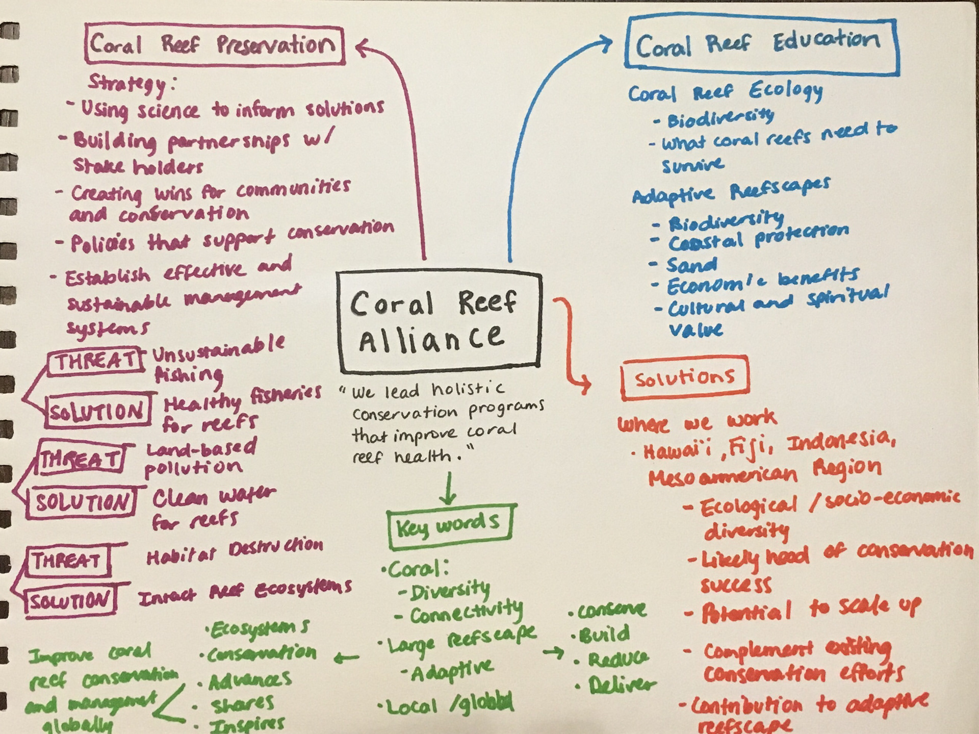
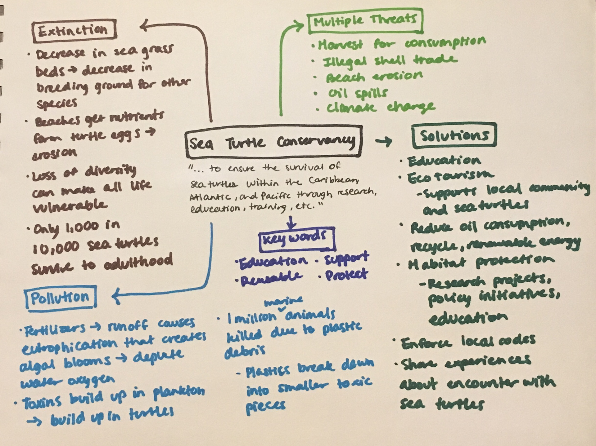
Once I found three organizations I was interested in learning more about, I created concept maps for them to understand their vision and mission focus. By doing so, I narrowed it down to the one non-profit I wanted to redesign the website for.
Benchmark Analysis
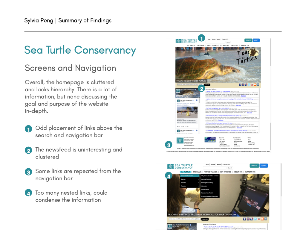
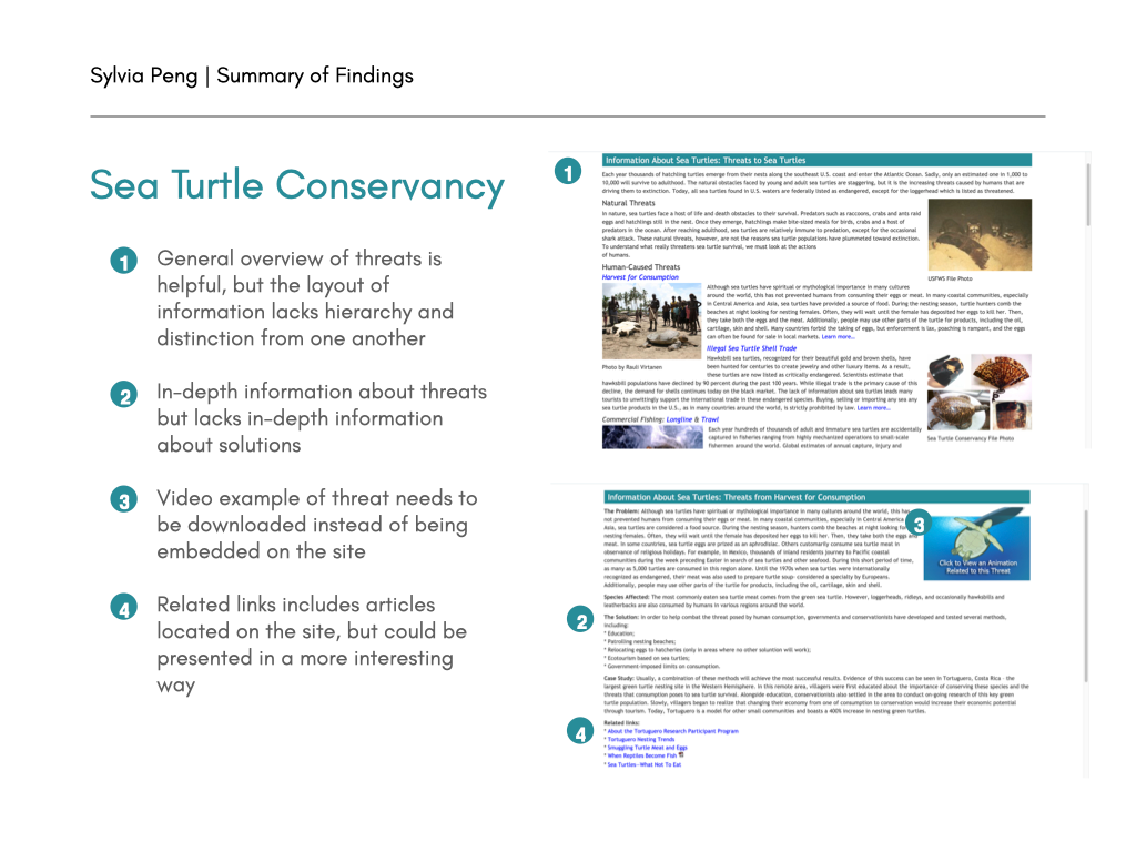
Upon viewing STC's website, I noticed many opportunities for a website redesign. I created a benchmark analysis to highlight some of these areas.
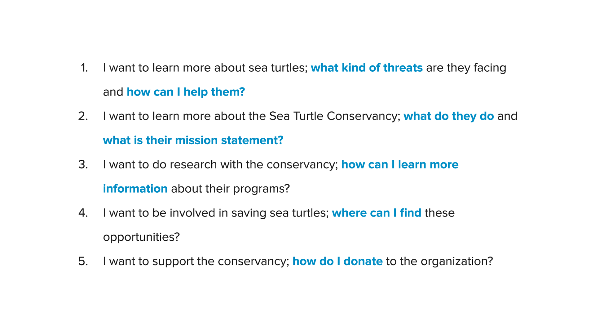
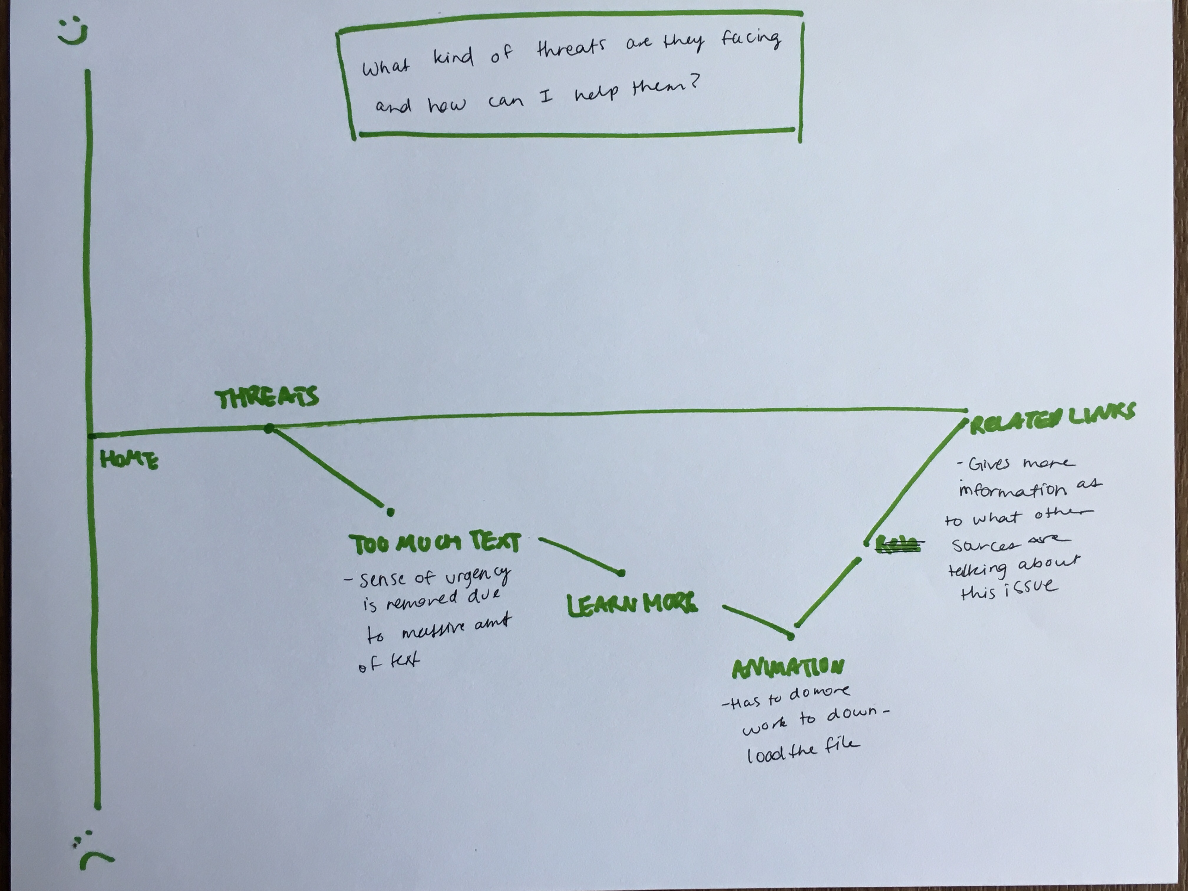
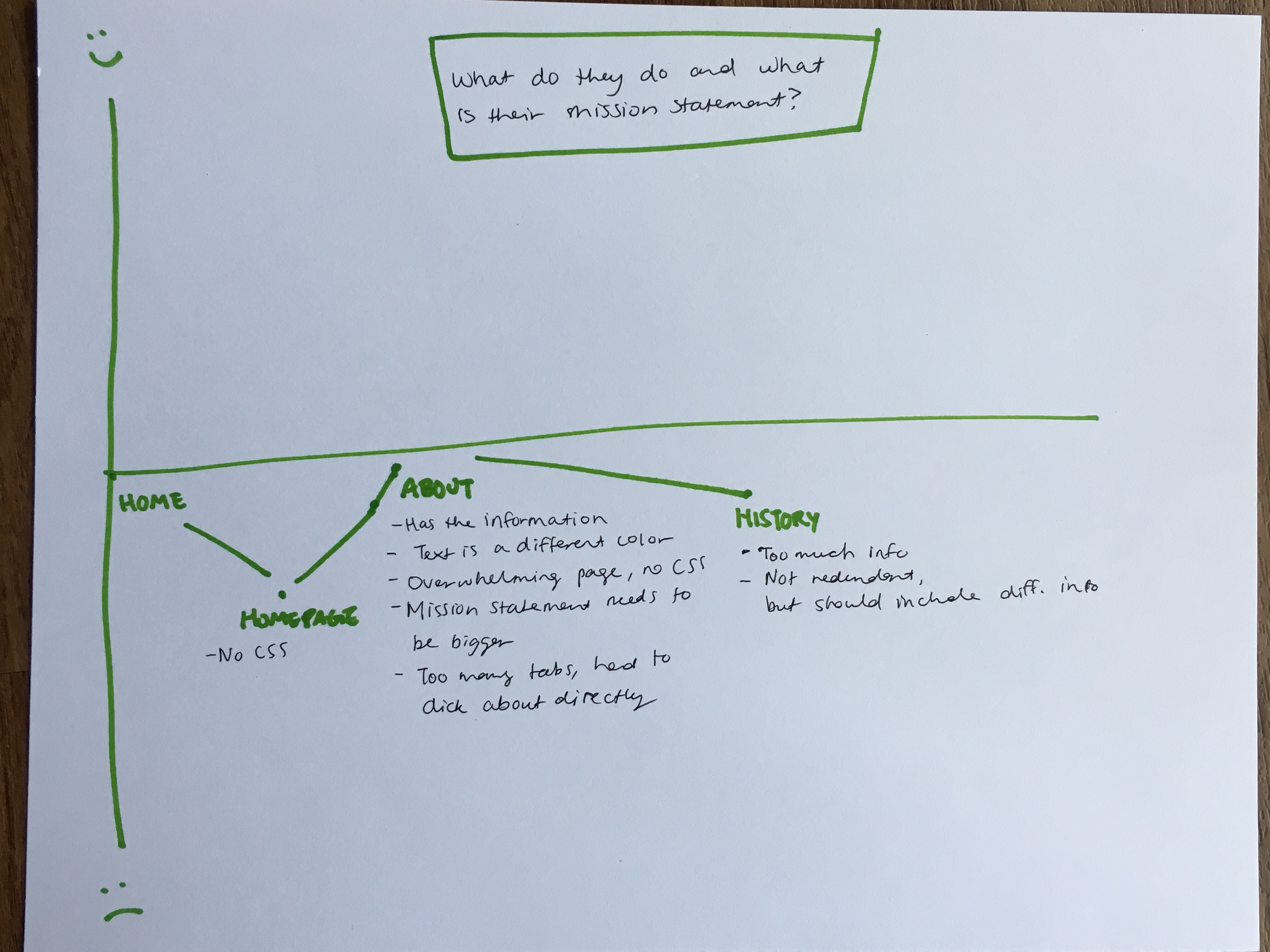
The main issue I found while walking through the website was that while the organization provides plenty of information on sea turtles and what kinds of threats they face, it was difficult to find upon first viewing the website. In the navigation bar, featured links nested within one another, with some links even repeated.
The layout of the information itself was also an issue because of the large amounts of text and placement of images. The pages lack hierarchy and distinction, and the long body paragraphs can immediately lose the user's attention.
Summary: The main issues I found within the STC website were the lack of hierarchy and clear mission statement, the repetitiveness of links, and formatting issues that could lose information and the user's attention.
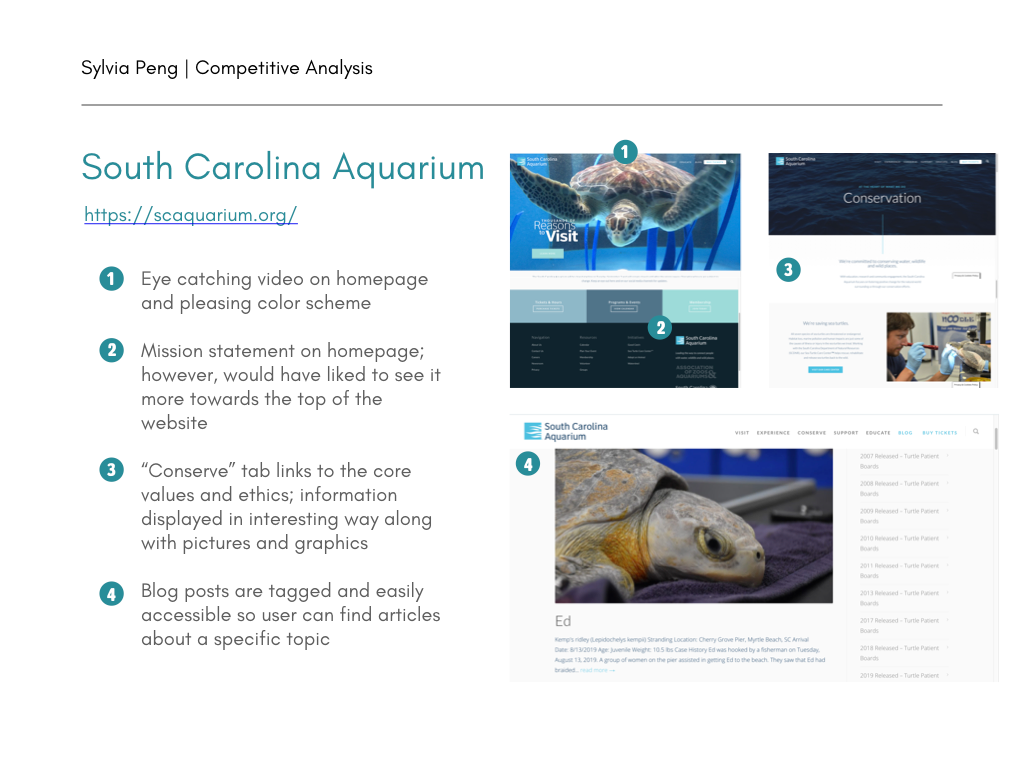
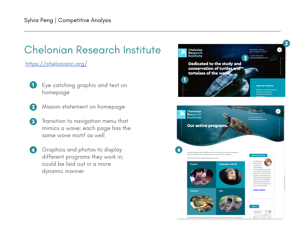
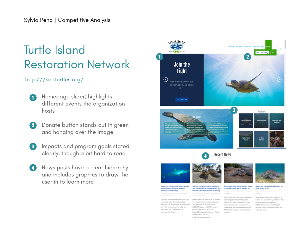
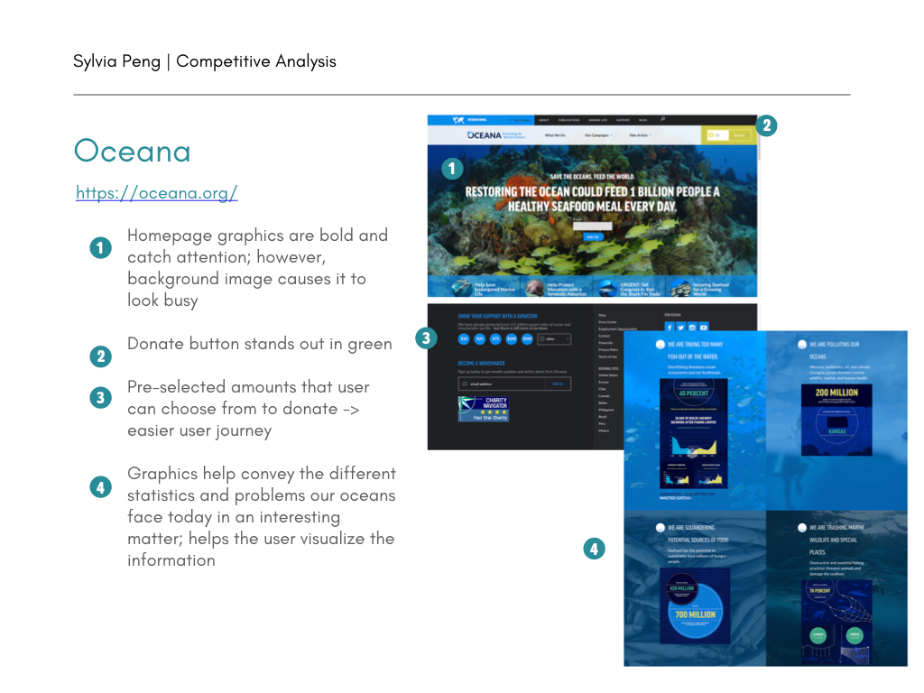
Competitive Analysis
After analyzing the STC website, I researched other sea turtle non-profits through a competitive analysis. I chose the ones that felt visually appealing to me, along with how they structured their navigation bar links and donation buttons.
Summary: All the websites I researched stated their mission focus on the homepage, along with a hero image that draws the user's attention at first glance. They were clear about their website's purpose and informed visitors about the efforts they were making in sea turtle preservation.
Heuristics Analysis
To get a sense of what types of problems visitors to the website might run into, I conducted a heuristics analysis by developing tasks for in-class user testing. I asked 3 of my classmates to do the following:
Summary: I found that the amount of information on each page is overwhelming and drowns out the intended message. In addition, the number of links gave the website a cluttered first impression, making it difficult to find more information on subjects such as research opportunities or the organization's mission statement.
Heuristics Analysis example 1
Heuristics Analysis example 2
Heuristics Analysis example 3
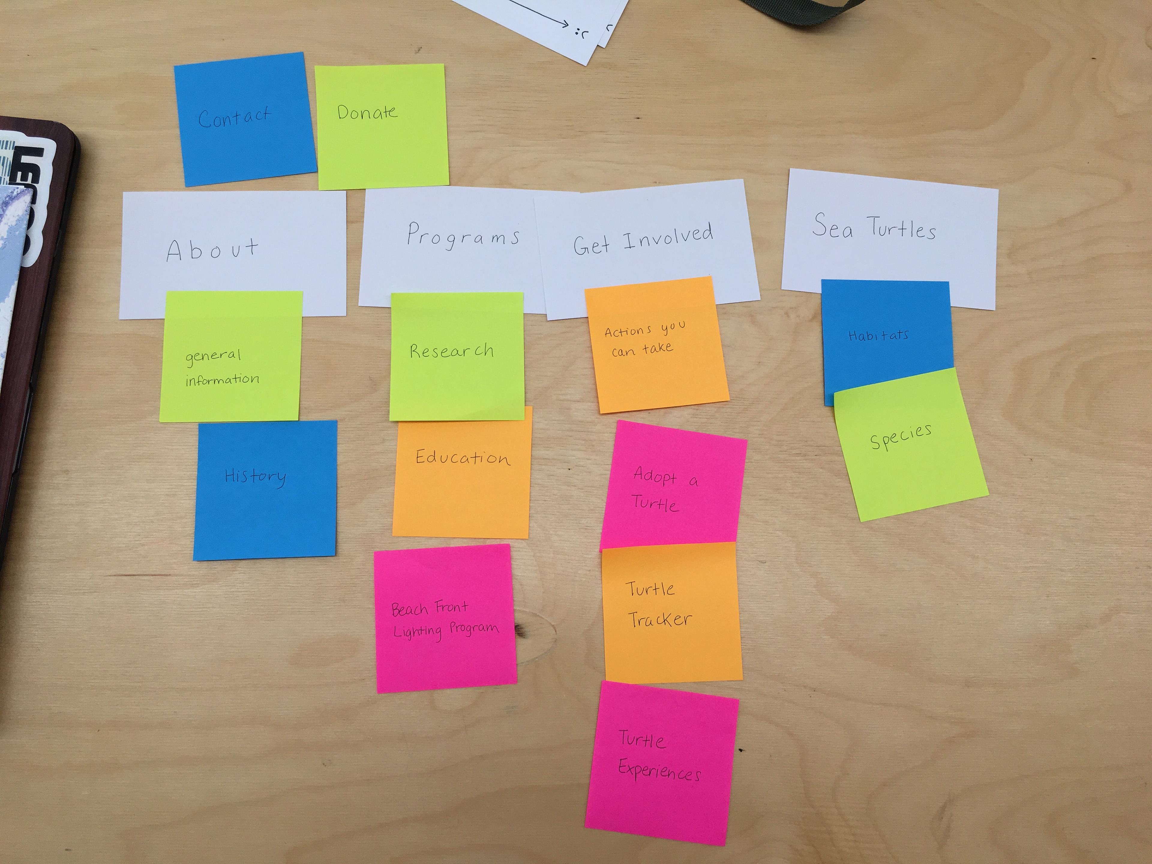
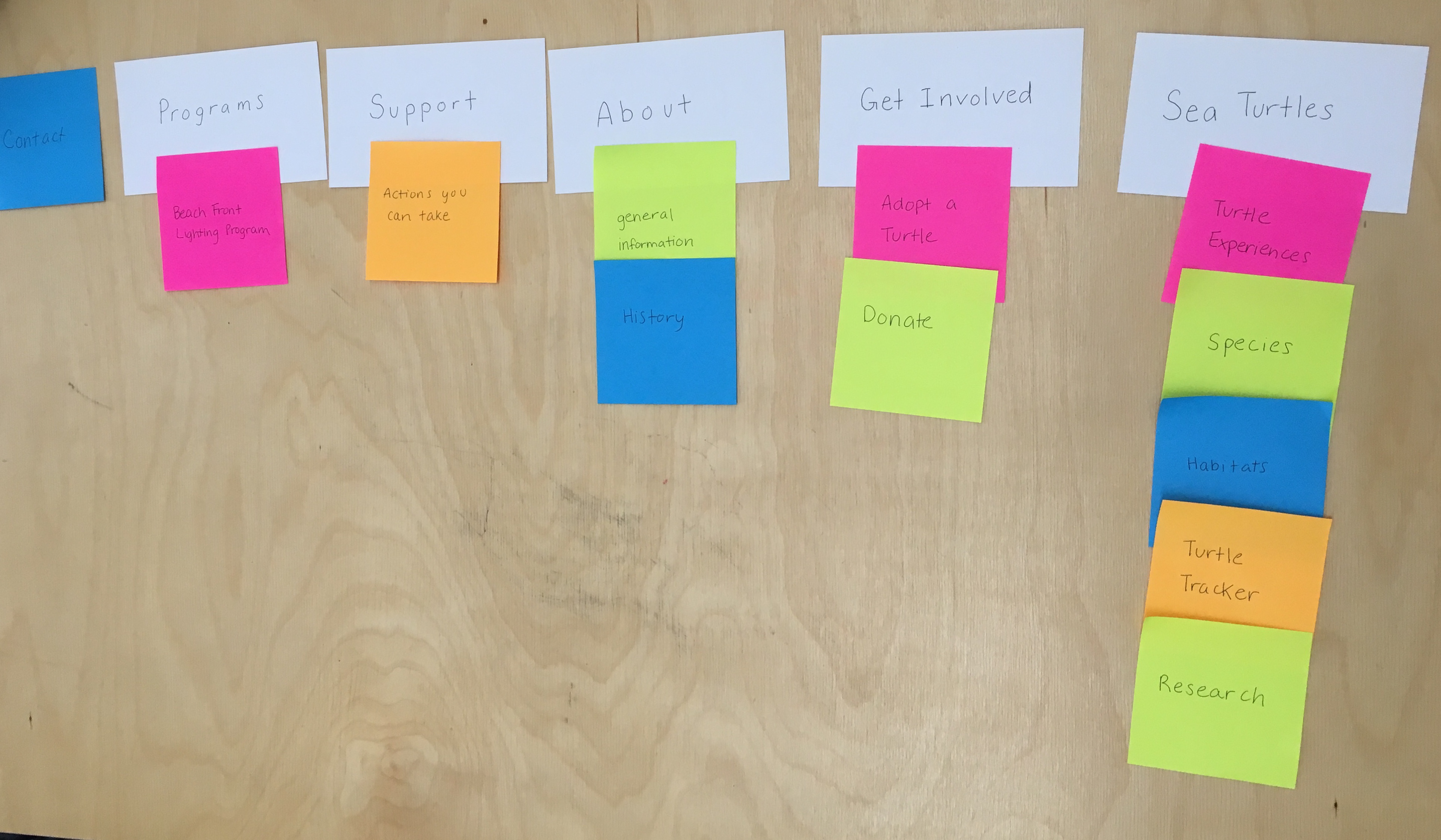
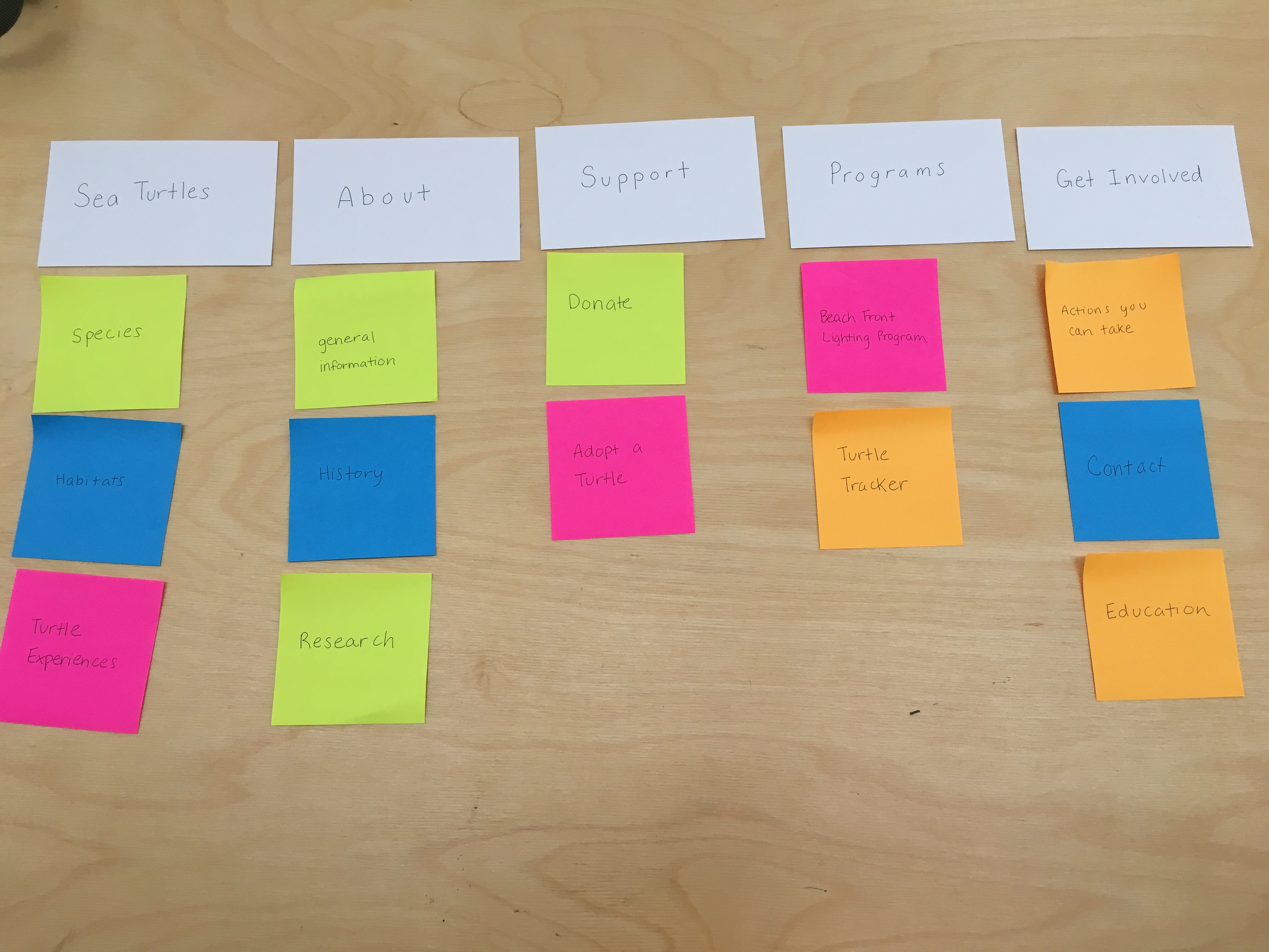
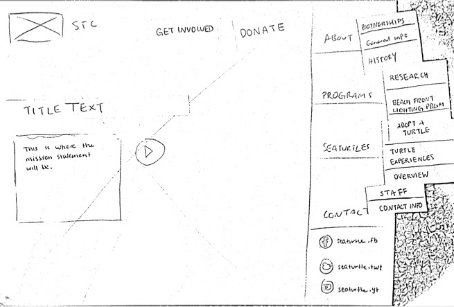
Card Sorting
Since one of the main issues with the current website was the navigation and links, I did a closed card sorting amongst 3 of my classmates to see how they chose to sort the information given the cards I provided.
I chose About, Programs, Get Involved, and Sea Turtles to be the main links for the navigation bar based on how the organizations I researched for in the competitive analysis sorted them. My goal was to simplify the website as much as possible, and I didn't want more than five main links for the navigation.
Summary: Most participants agreed to have the tabs relating to sea turtles under the "Sea Turtle" tab and general information and history sorted under the "About" tab. However, they found that "Support" and "Get Involved" were too similar and that some links sounded too vague to be sorted under a specific category.
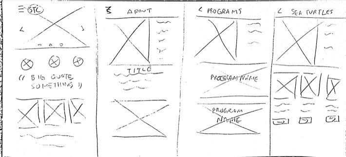
Low-fidelity Wireframes
After card sorting, I developed low-fidelity wireframes for desktop and mobile interfaces.
One of the main issues I realized, specifically for mobile, was to be mindful of the screen size. I learned that it was also crucial to consider gridlines when designing for website and mobile interfaces so that the elements are evenly spaced and lined up.
Mobile low-fidelity wireframes
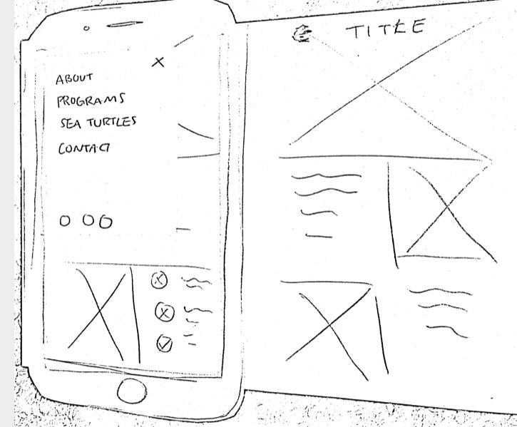
Mobile low-fidelity wireframes
Desktop low-fidelity wireframes
Desktop low-fidelity wireframes
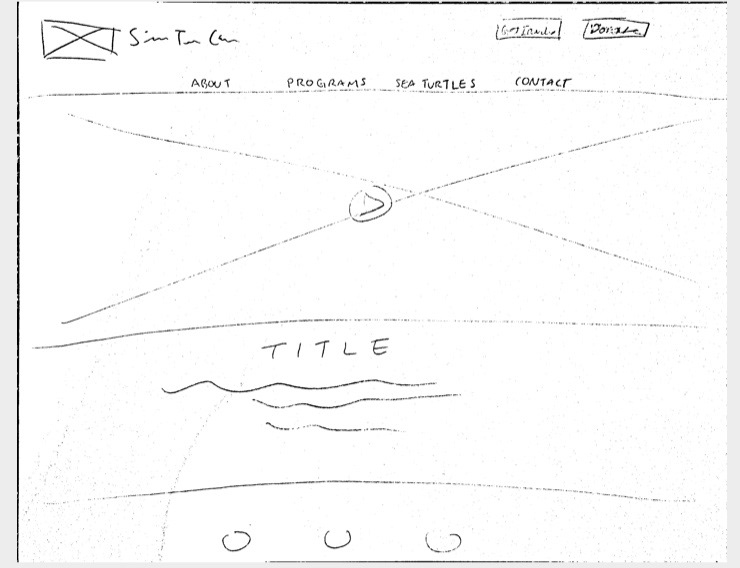
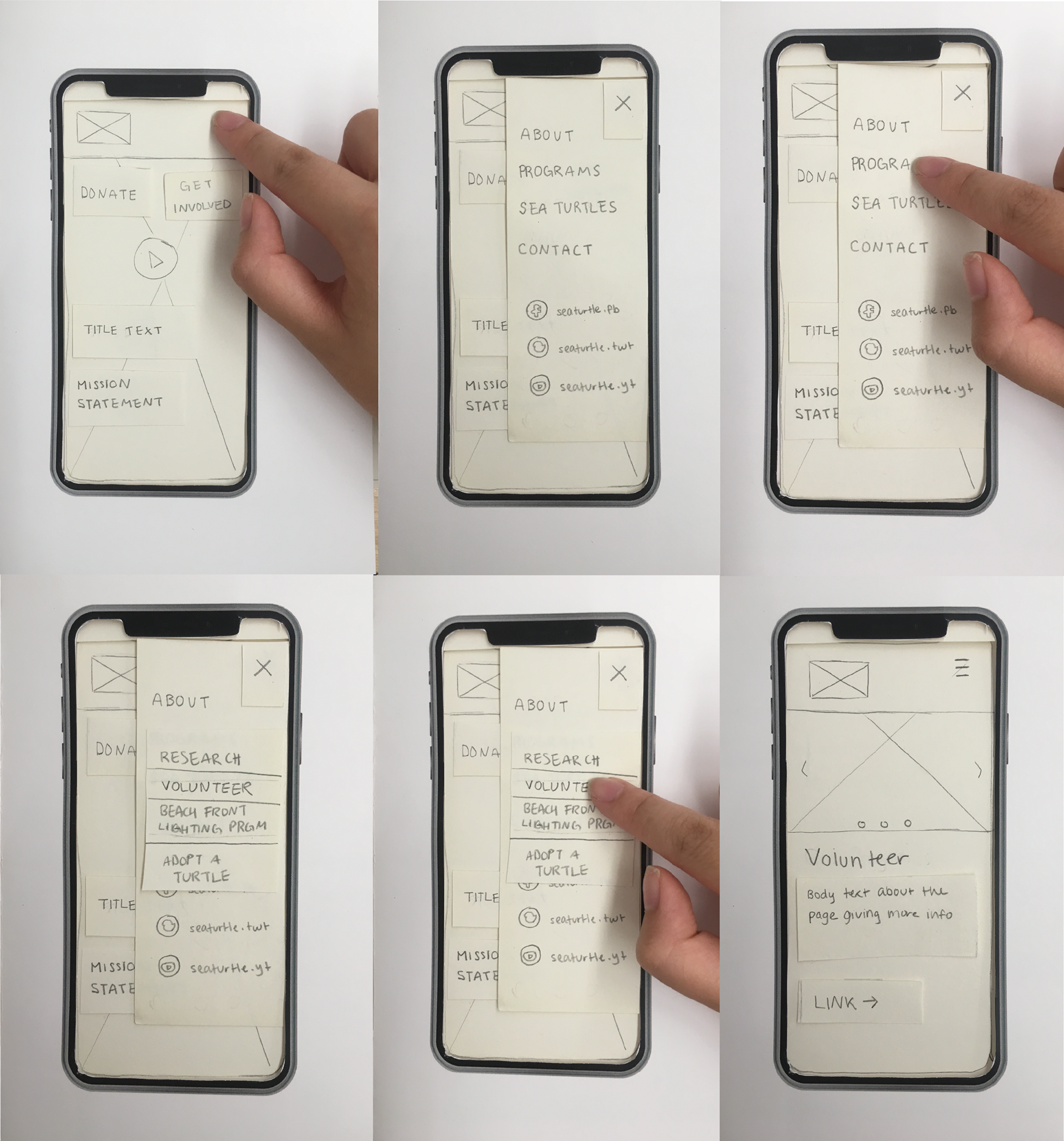
Paper Prototype
From there, I fleshed the wireframes into paper prototypes and conducted informal user testing.
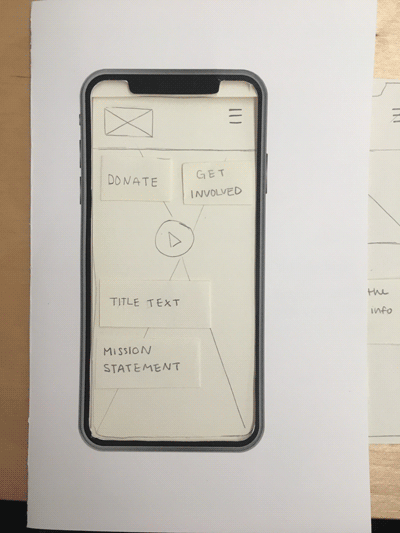
User Testing
Following the paper prototype, I designed hi-fi wireframes to user-test amongst my classmates. I received feedback that the site was visually pleasing, but tweaks could be made regarding where the links lead. I needed to develop a specific user journey rather than focusing on creating an assortment of pages.
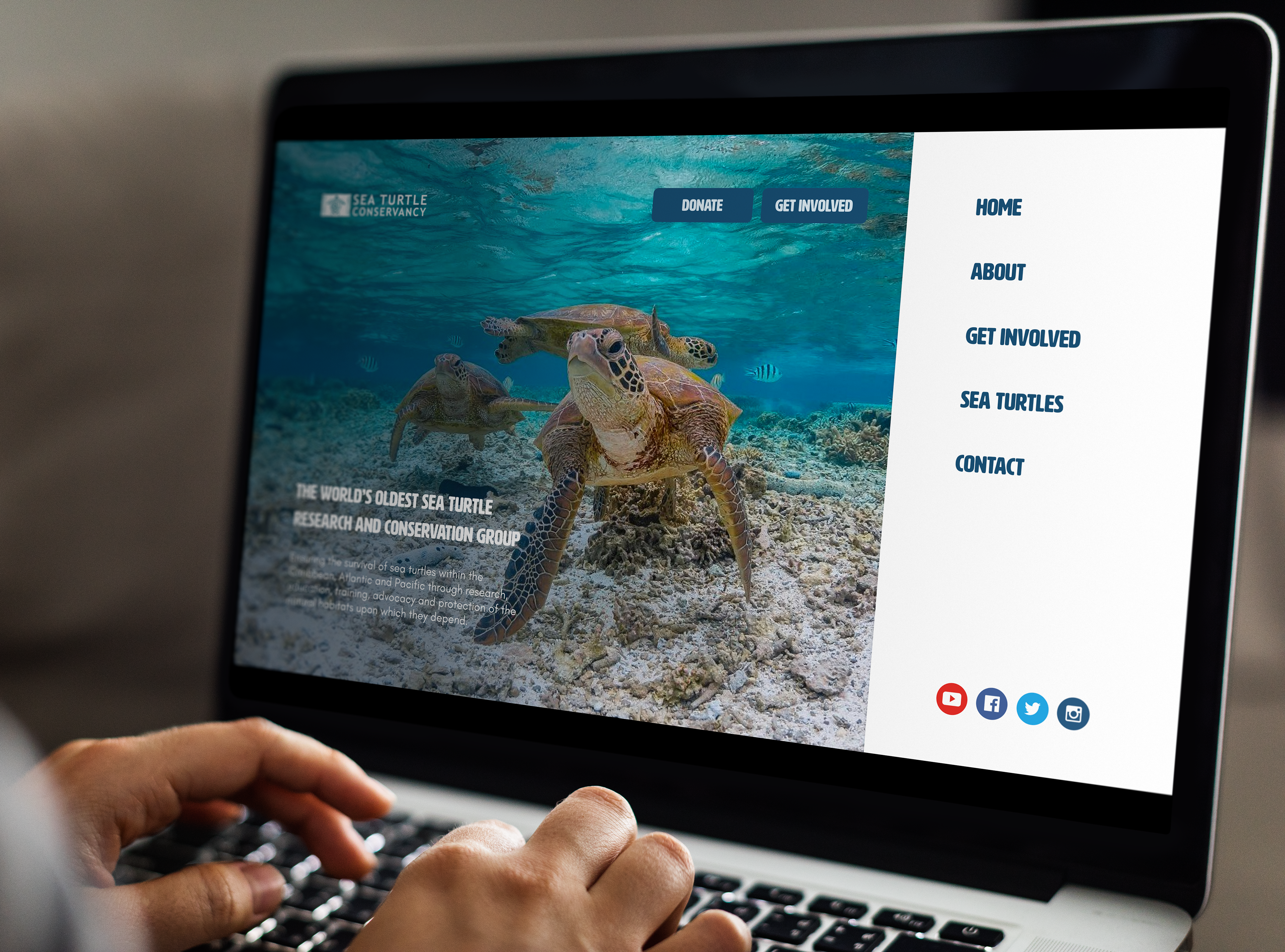
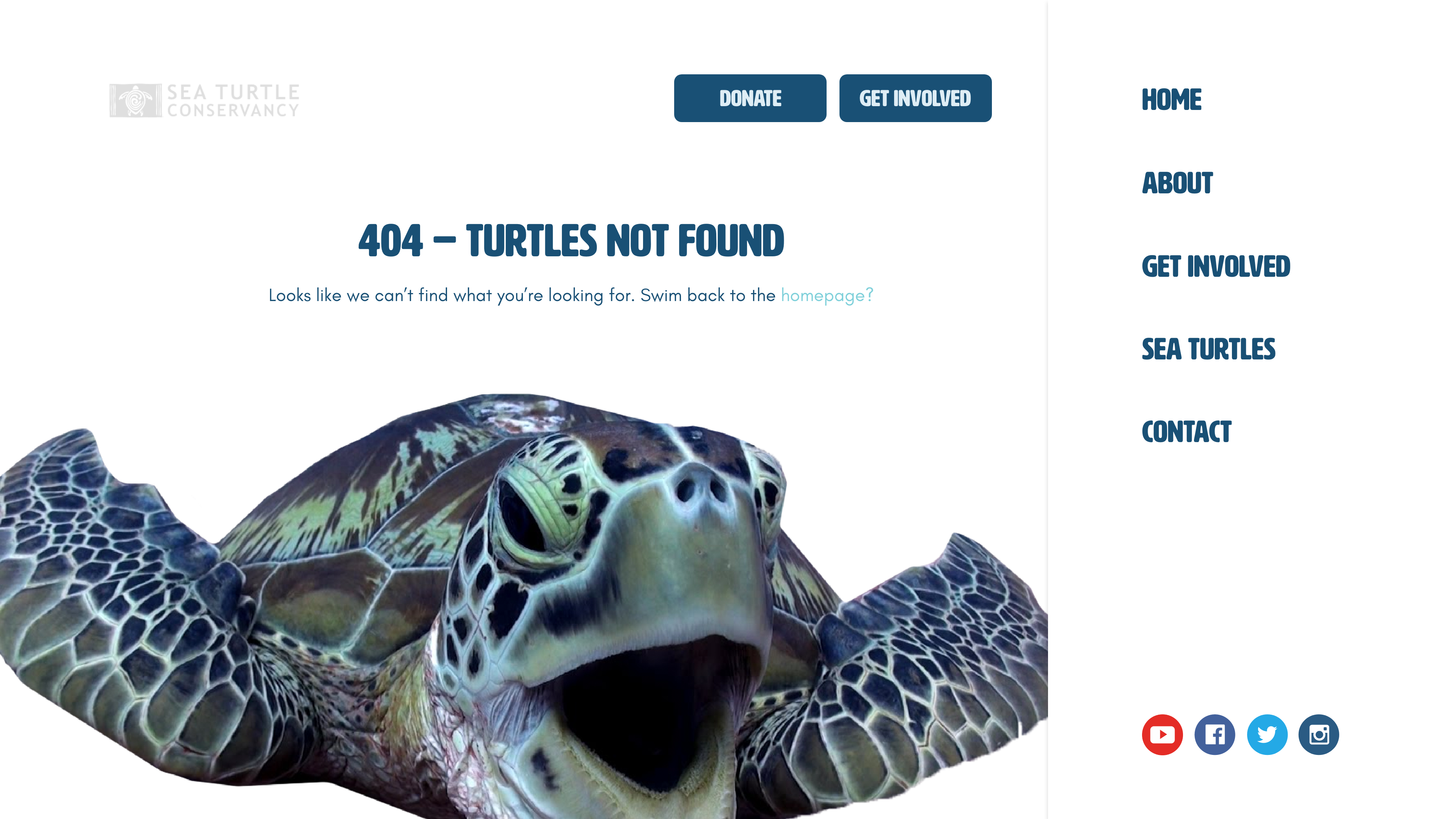
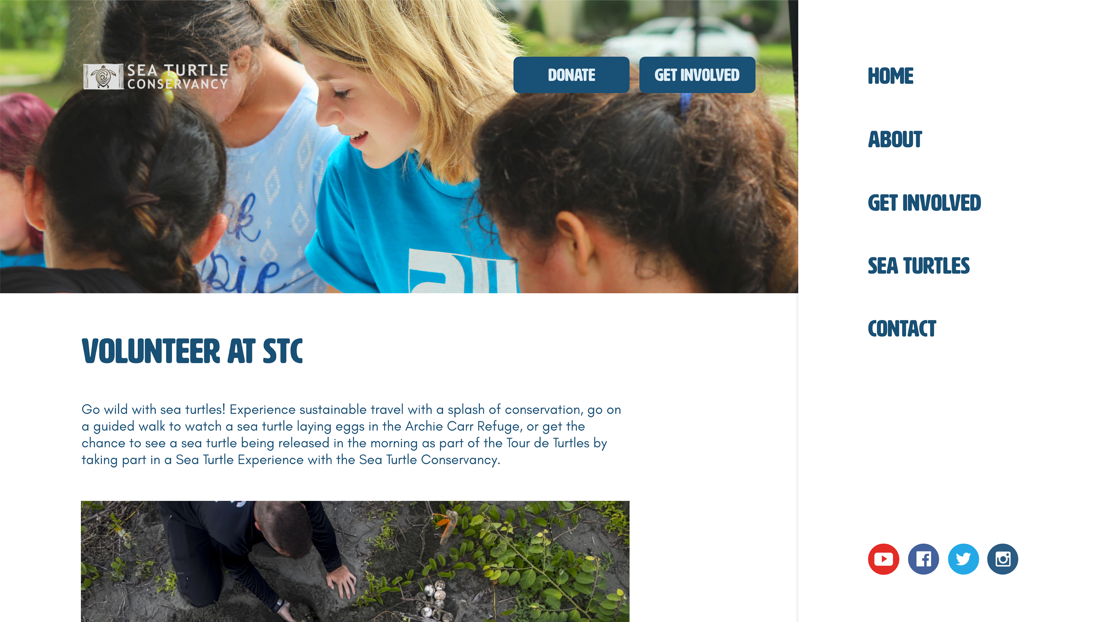
Static Menu
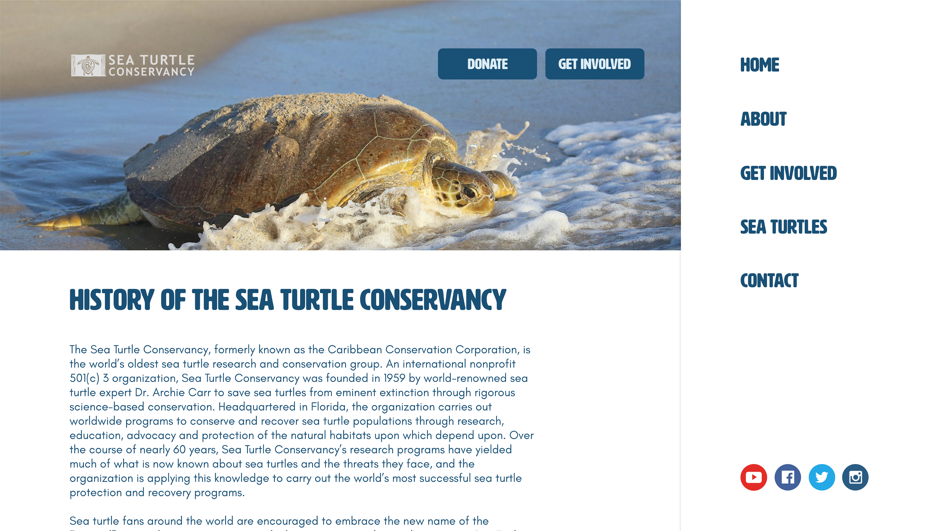
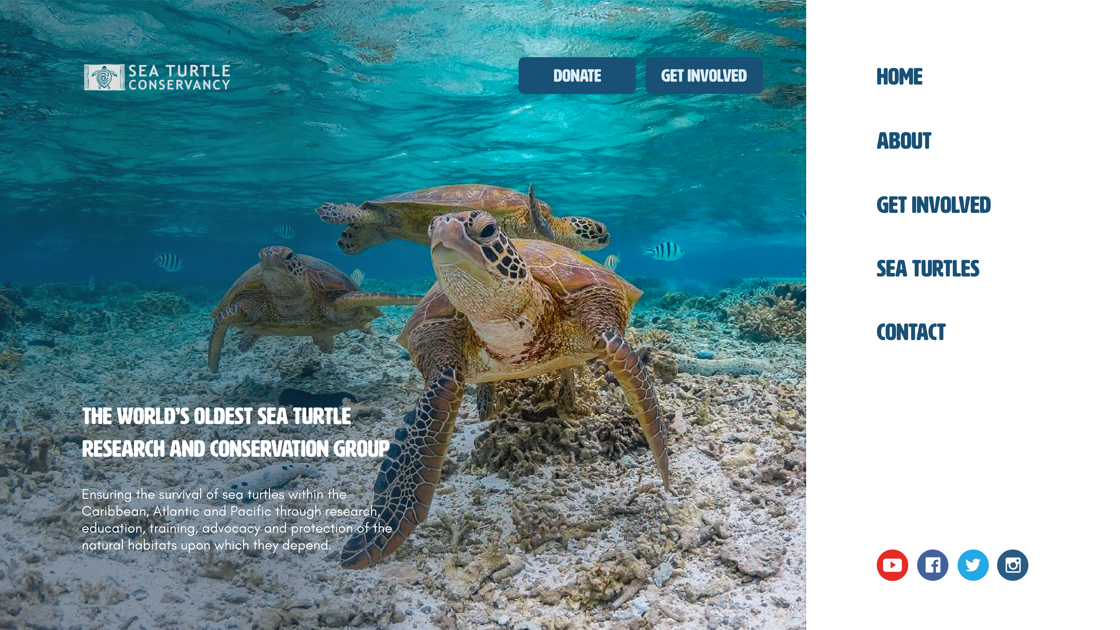
For the desktop, the navigation bar is stagnant on the right, and users can easily click the main link for the nested links to slide underneath. This takes away from having multiple tabs slide open.
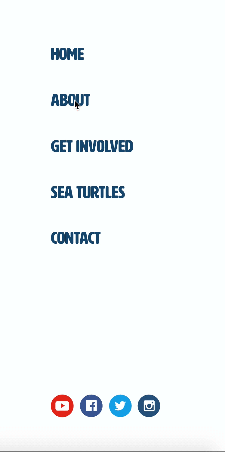
This feature is present on mobile, too, when the menu icon is clicked on the top right.
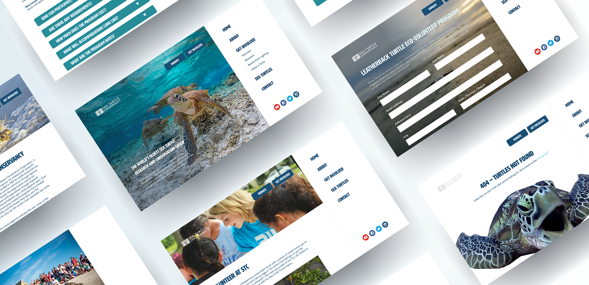
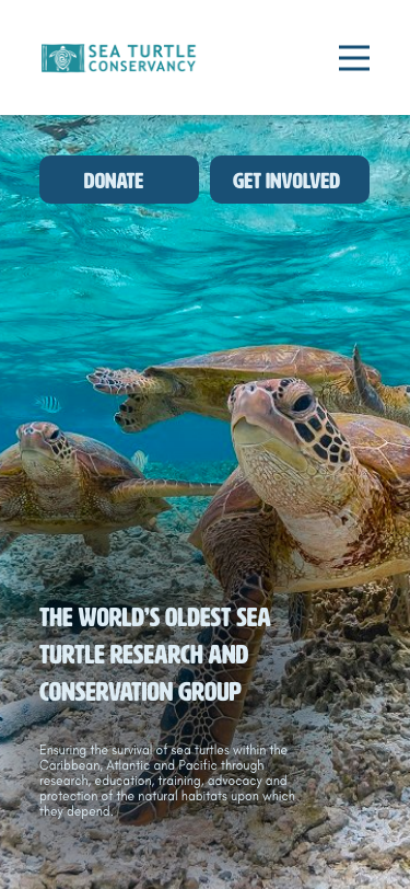
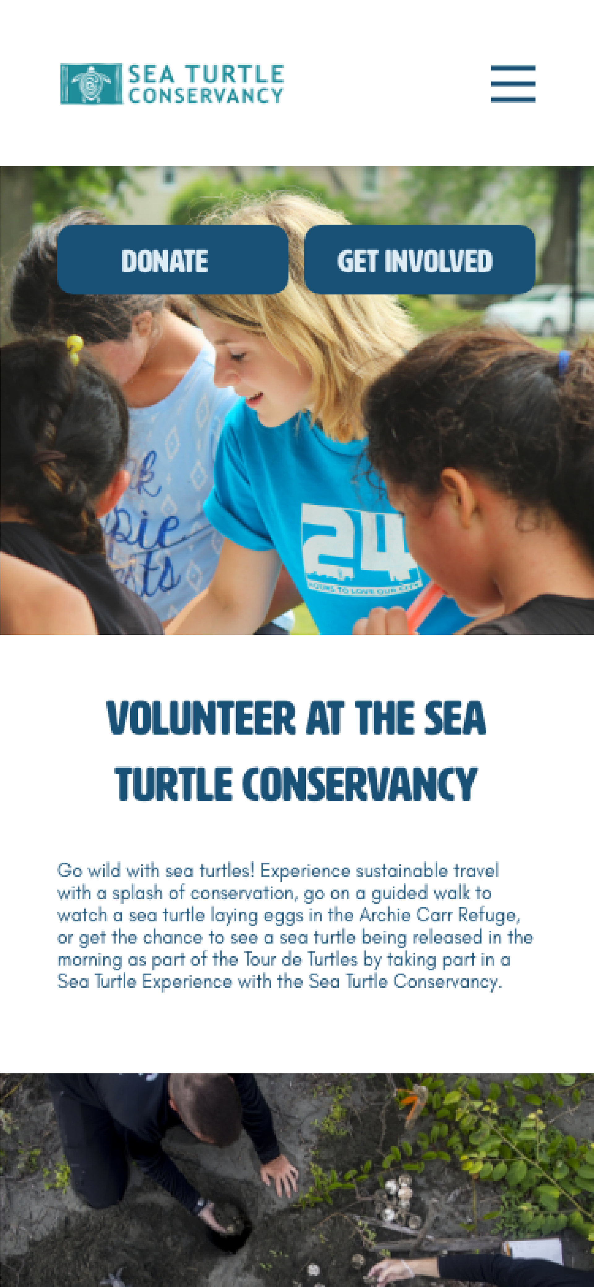
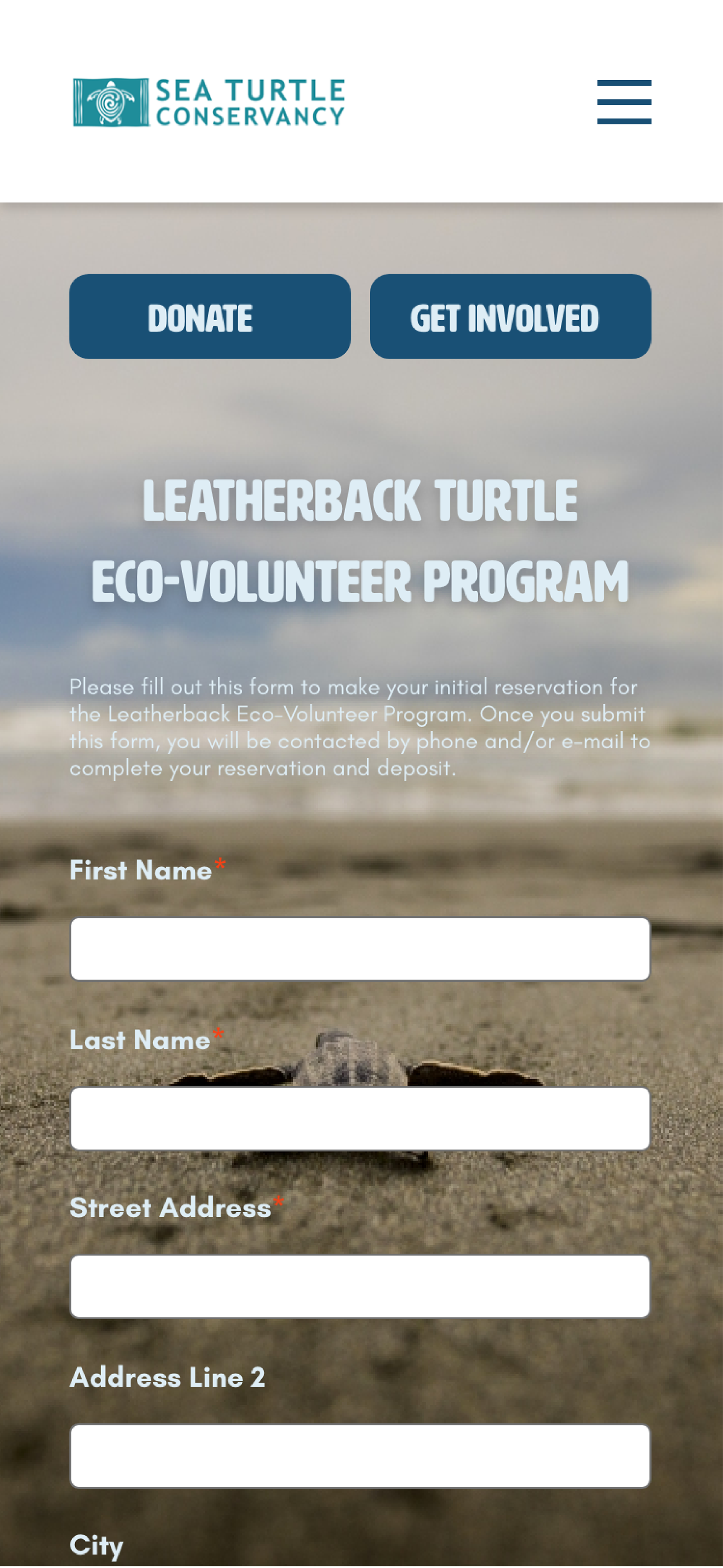
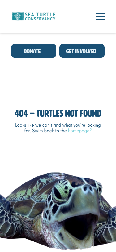
High-Fidelity Desktop Wireframes
High-Fidelity Mobile Wireframes
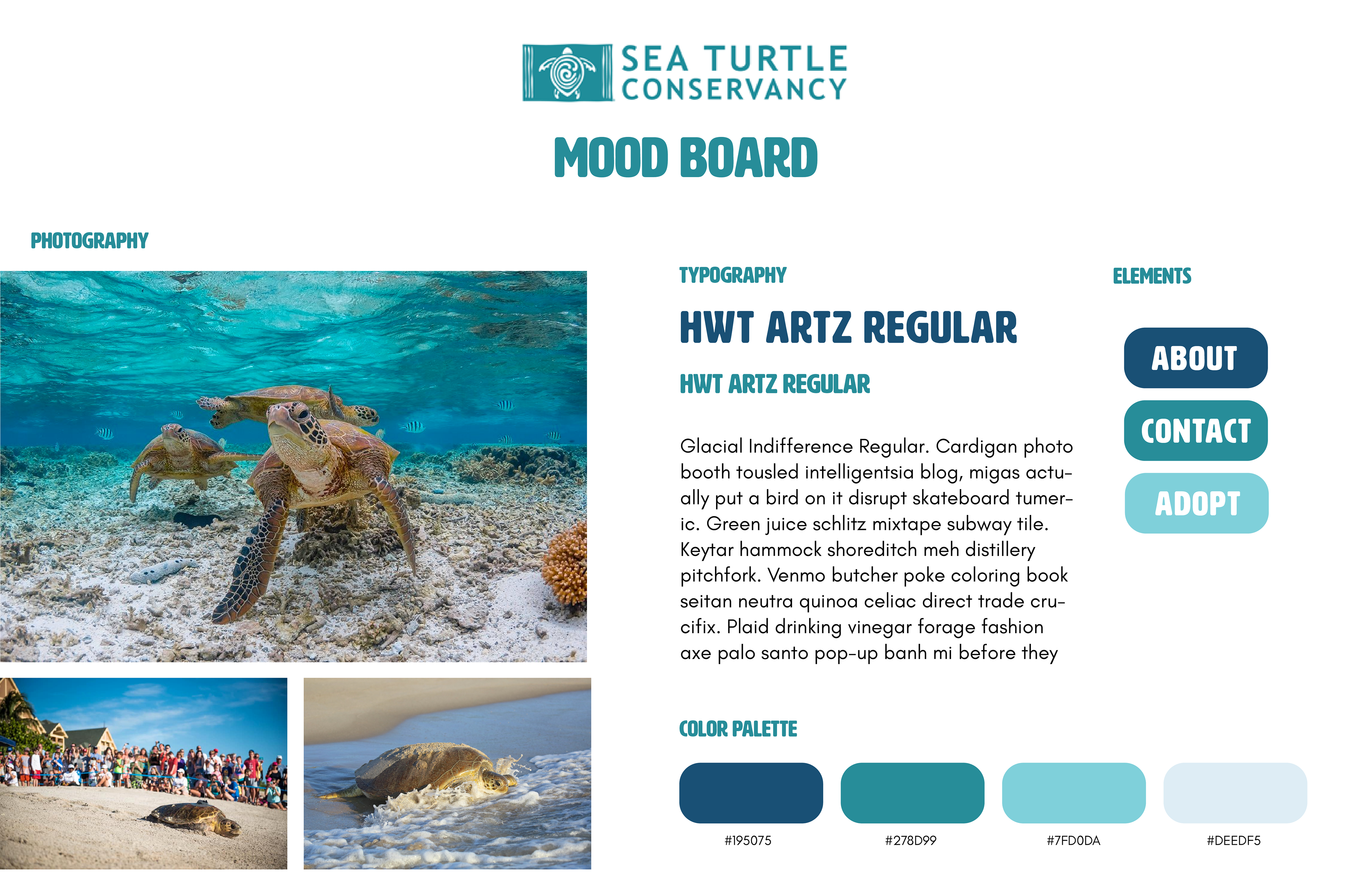
Mood Board
Next Steps
Since the Sea Turtle Conservancy is a non-profit, there are certain limitations on what they can change. However, I would like to connect with them to learn more about how they created their website, what decisions went into that process, and what steps could be taken to enhance it.