DURATION
15 weeks, March 2023 – July 2023
MY ROLE
UI/UX Designer
Link Up Idaho
How might we create a better user journey for the Link Up Idaho website?
The Link Up Idaho initiative is led by the Idaho Department of Commerce and the Idaho Broadband Advisory Board (IBAB) to expand internet access all across Idaho.
I was assigned as the designer on the project and developed an elevated, refreshed website for visitors who wanted to learn more about broadband in Idaho.
Benchmark Analysis
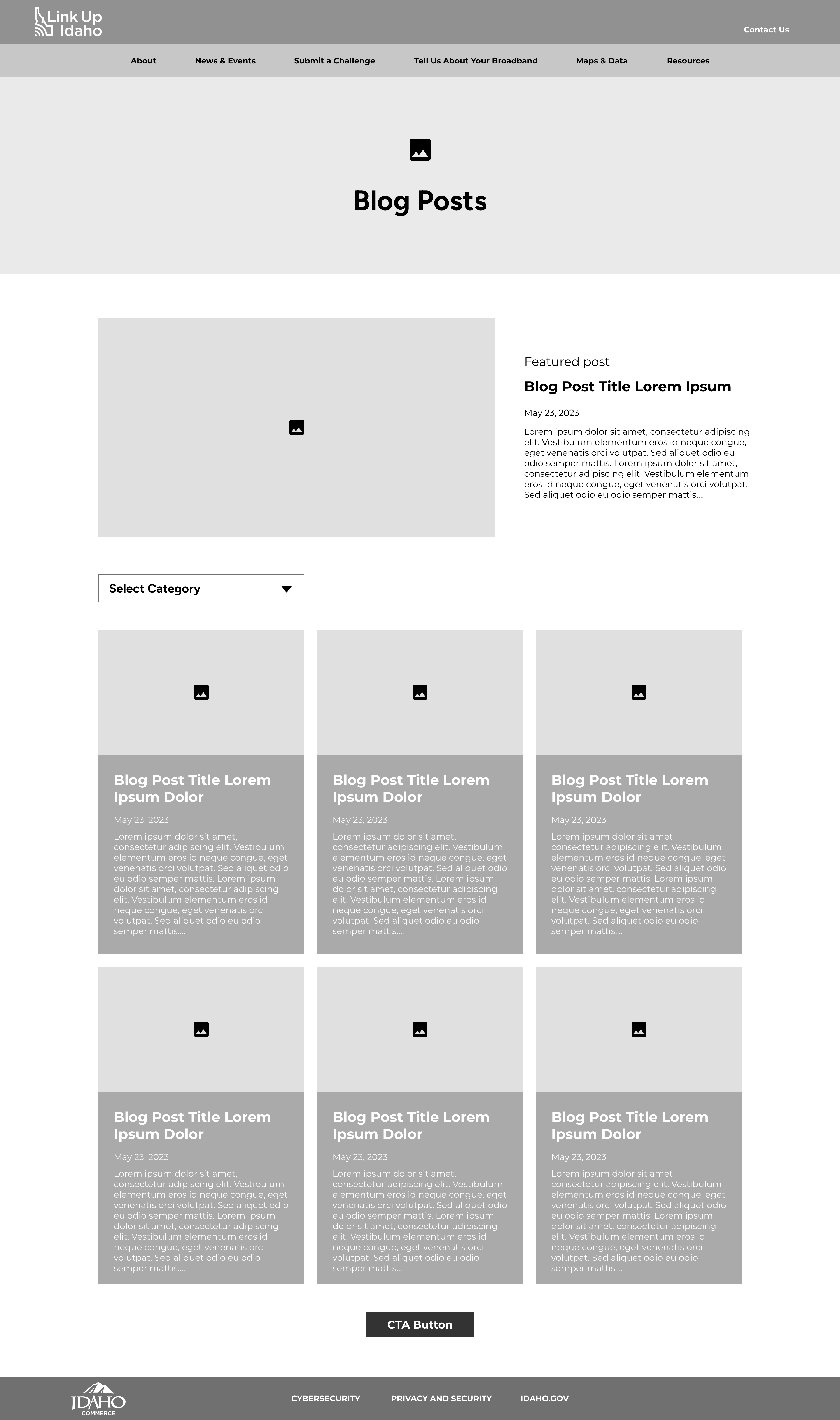
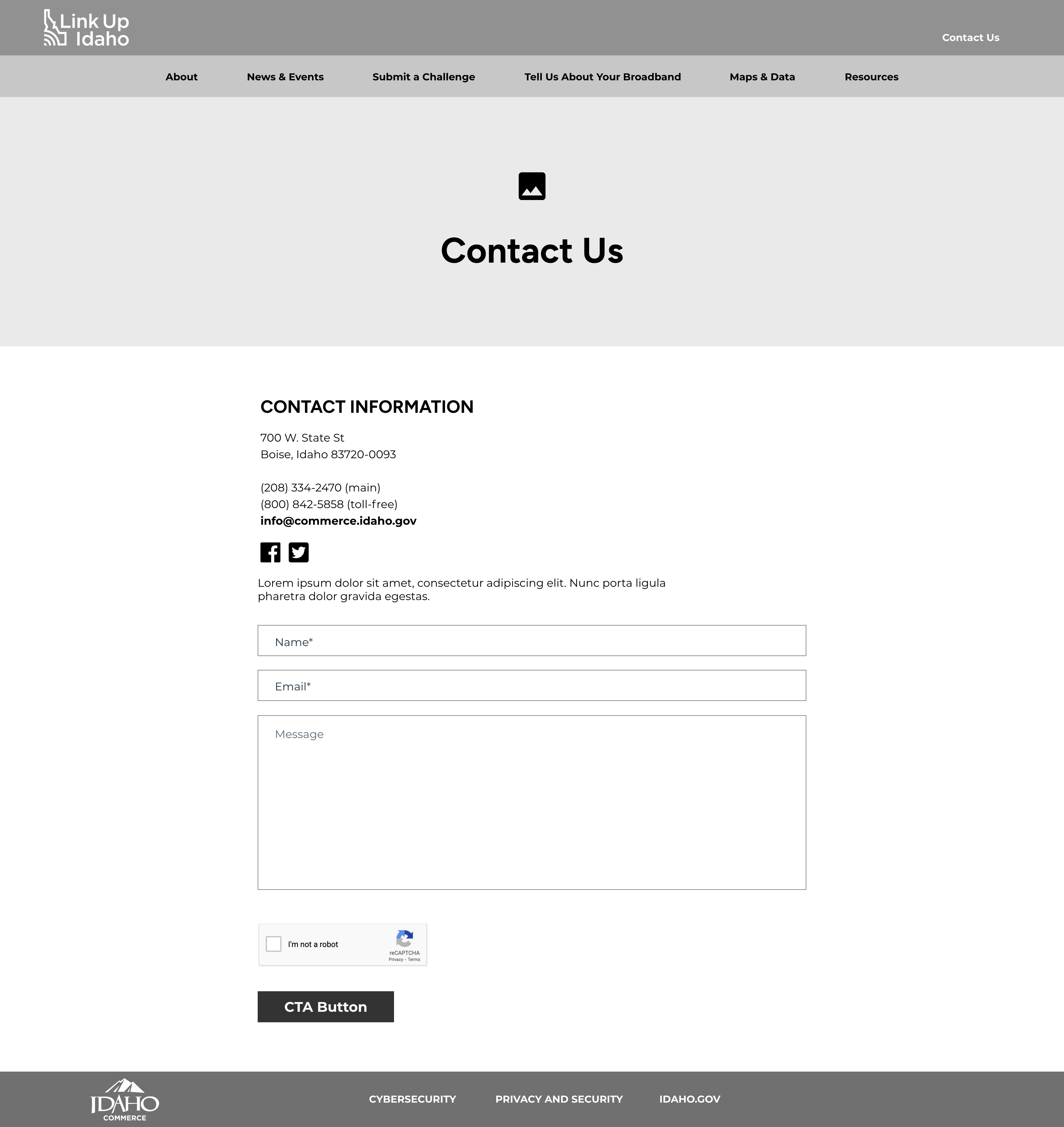
At the project kick-off meeting, the client discussed their goals for updating the website. The current site was more of a "band-aid" site, meaning it was barebones but had what they needed regarding content. They wanted the new website layout to include a blog page, survey forms, events, resources, and a contact page for the initial design.
With that information in mind, I analyzed the current site on what aspects could be improved. The website was only one page with external links once the user landed on the page. There was also no clear user flow for the homepage, with multiple links after another creating a crowded and overwhelming layout, especially for new visitors to the site.
Summary: The Link Up Idaho website team needed an updated website with a newly designed layout to match the Link Up logo and Commerce brand. I analyzed the page by brainstorming how to create optimal user engagement across all generally used devices.
Competitive Analysis
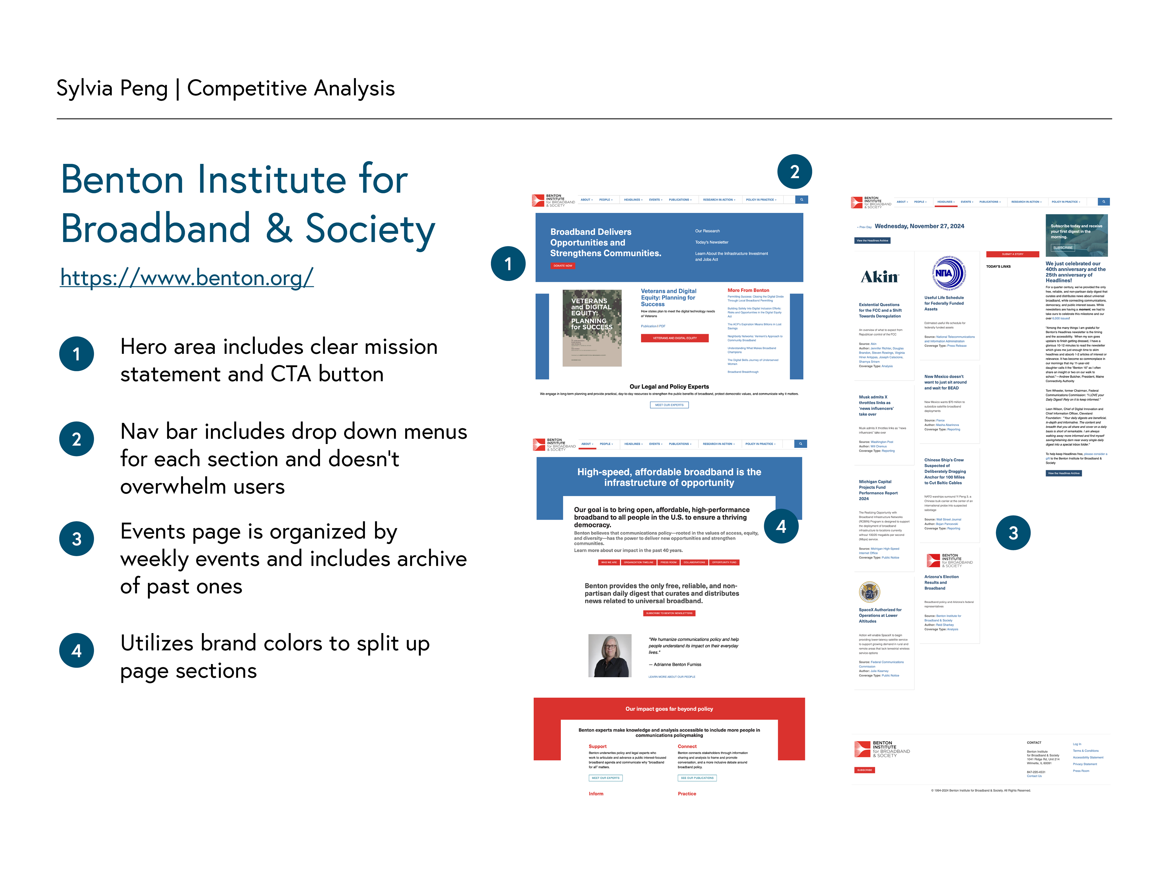
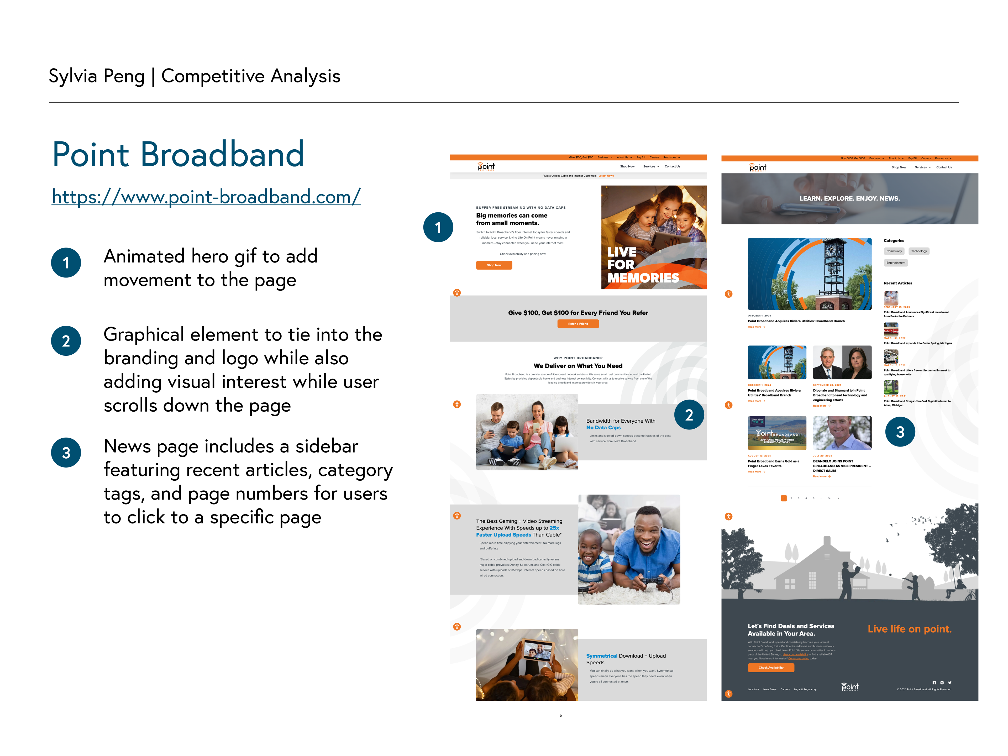
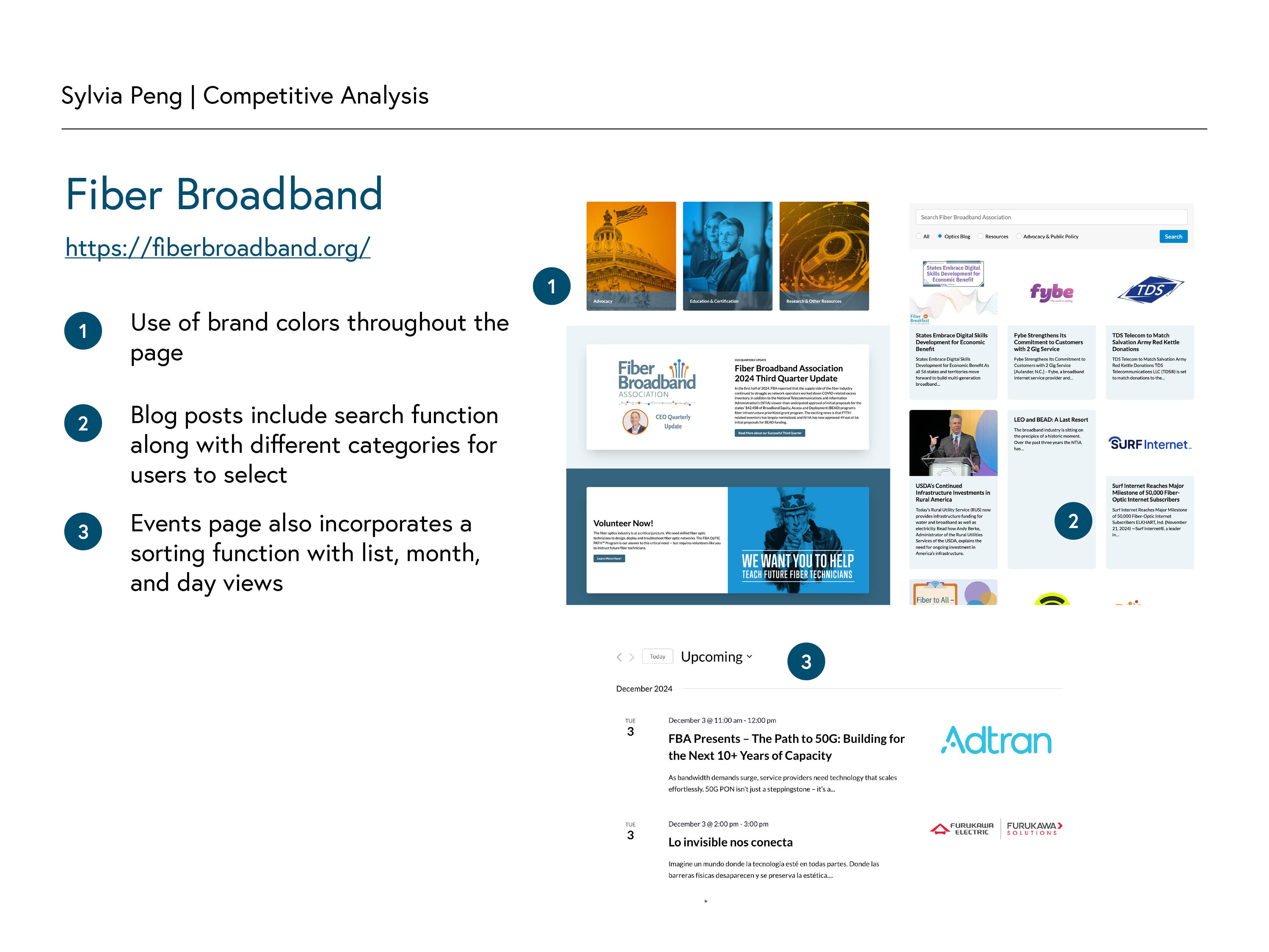
In addition to the benchmark analysis, I created a competitive analysis by researching various broadband websites with clean, minimalist looks that I wanted to implement for the redesign. I also focused on websites with blog and event pages to reference how they organized the different information in a way that wouldn't be overwhelming for users to browse through.
Summary: In my competitive analysis, I found that most websites incorporated their branding through design elements such as colored backgrounds or icons on their web pages. They also utilized drop-down menus in their navigation bars to condense their main menu links. The event and blog pages featured summaries and cards for users to click through if they were interested in learning more.
User Flow
After my initial research, I created a user flow to see which pages were needed, and how the user could navigate through an information-heavy site. Keeping the pages the client wanted to display in mind, I went through each possible user journey path and added a color-coded key for the client to understand as I walked through the user flow.
Low-fidelity Wireframes
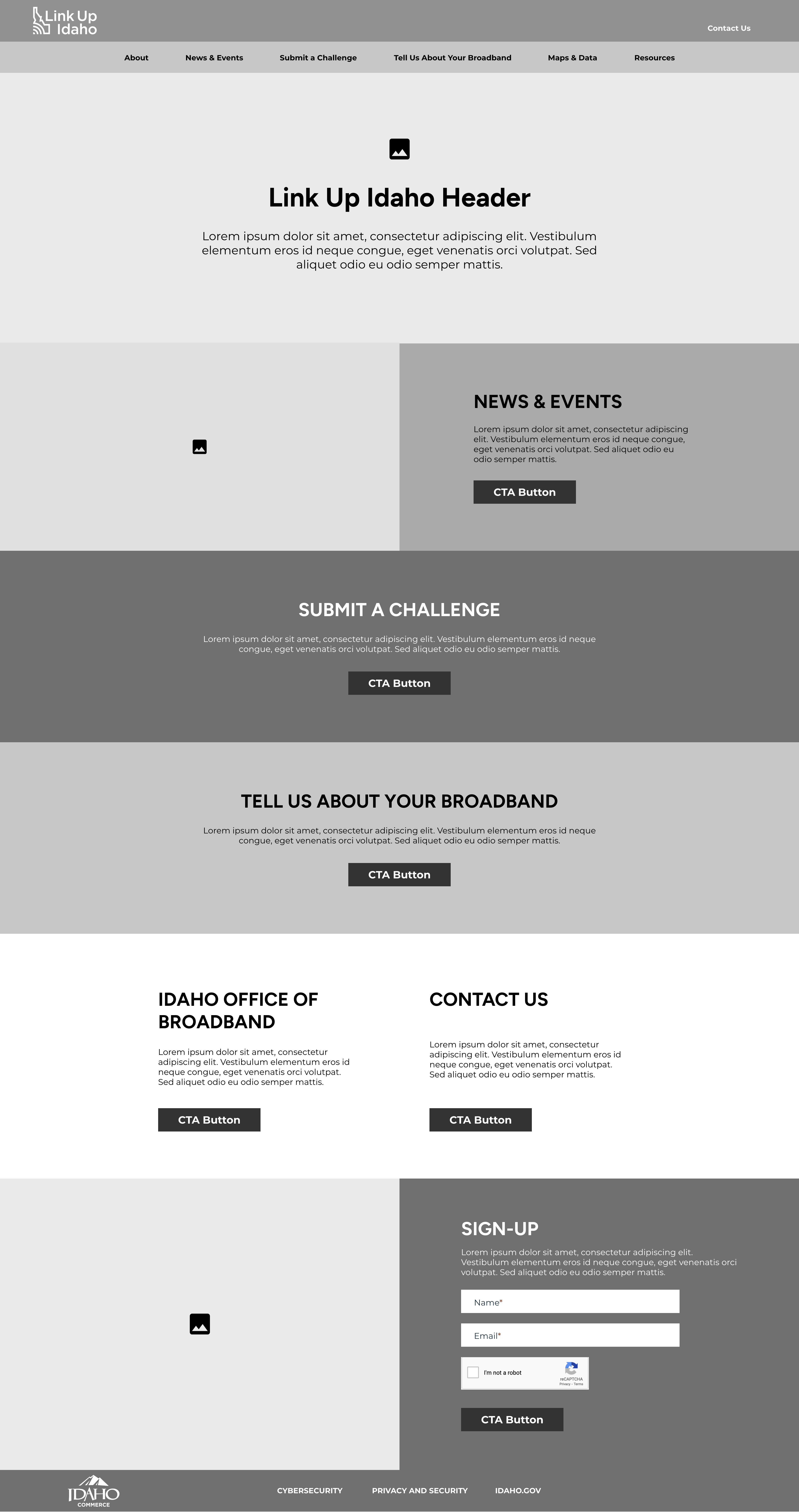
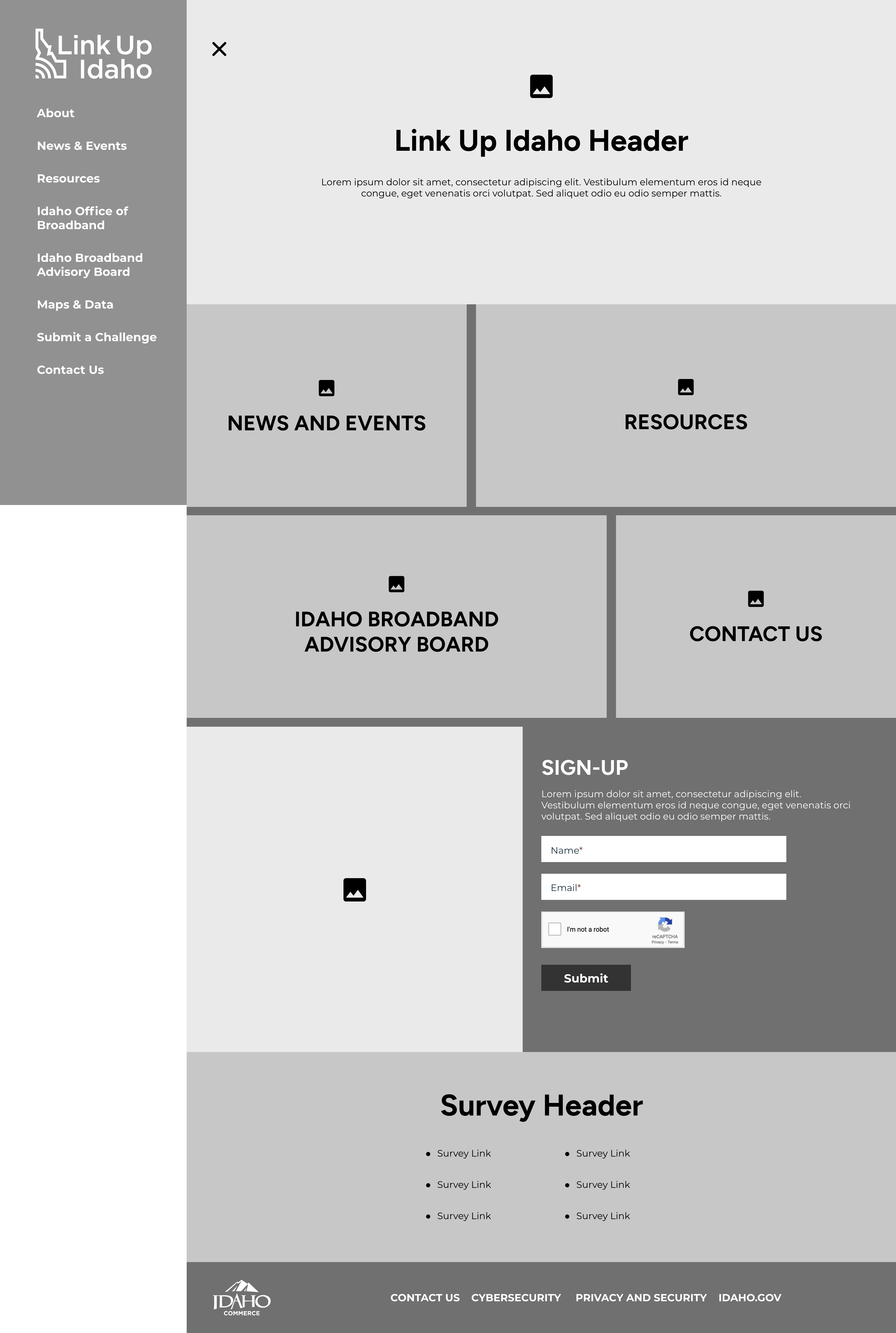
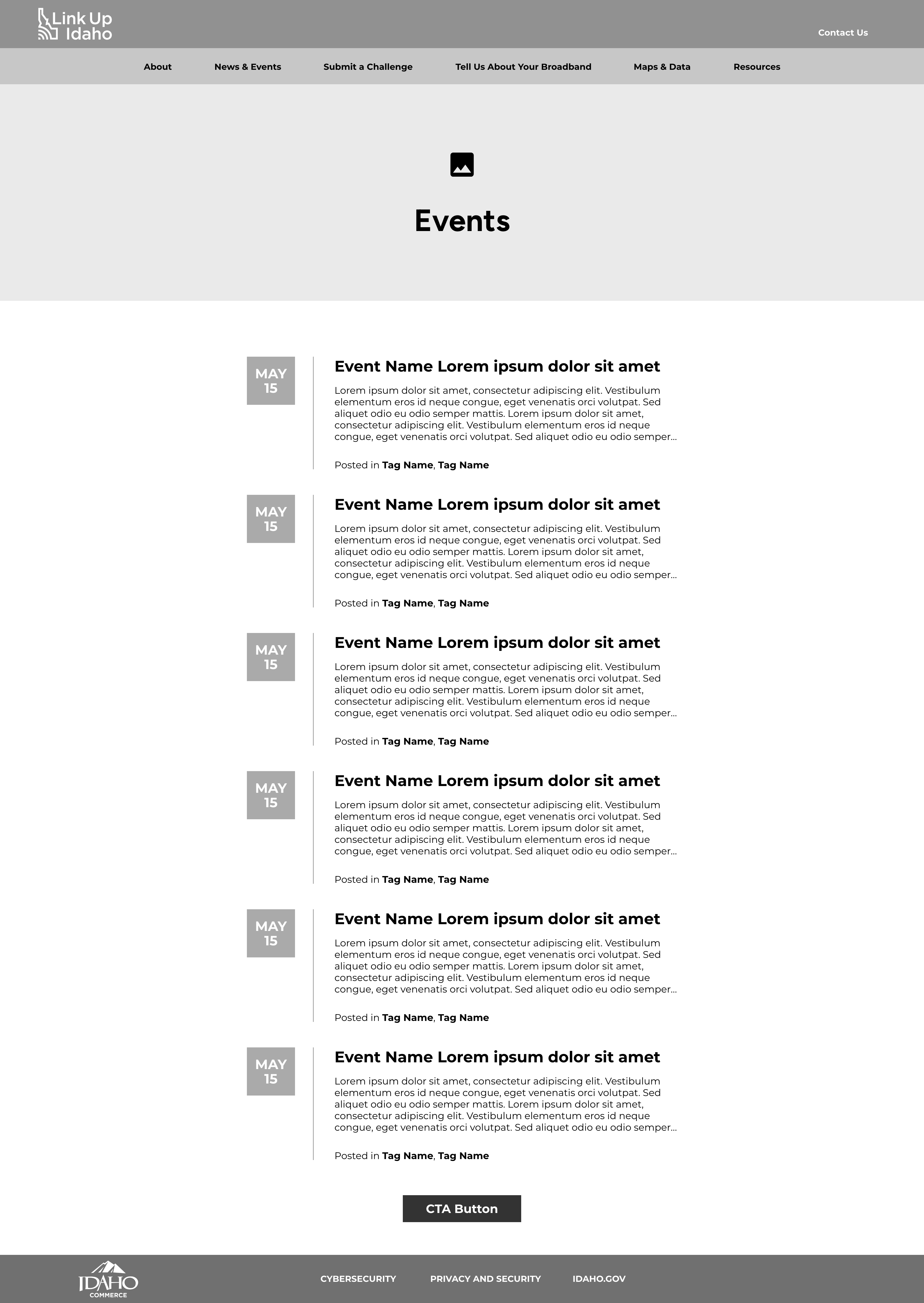
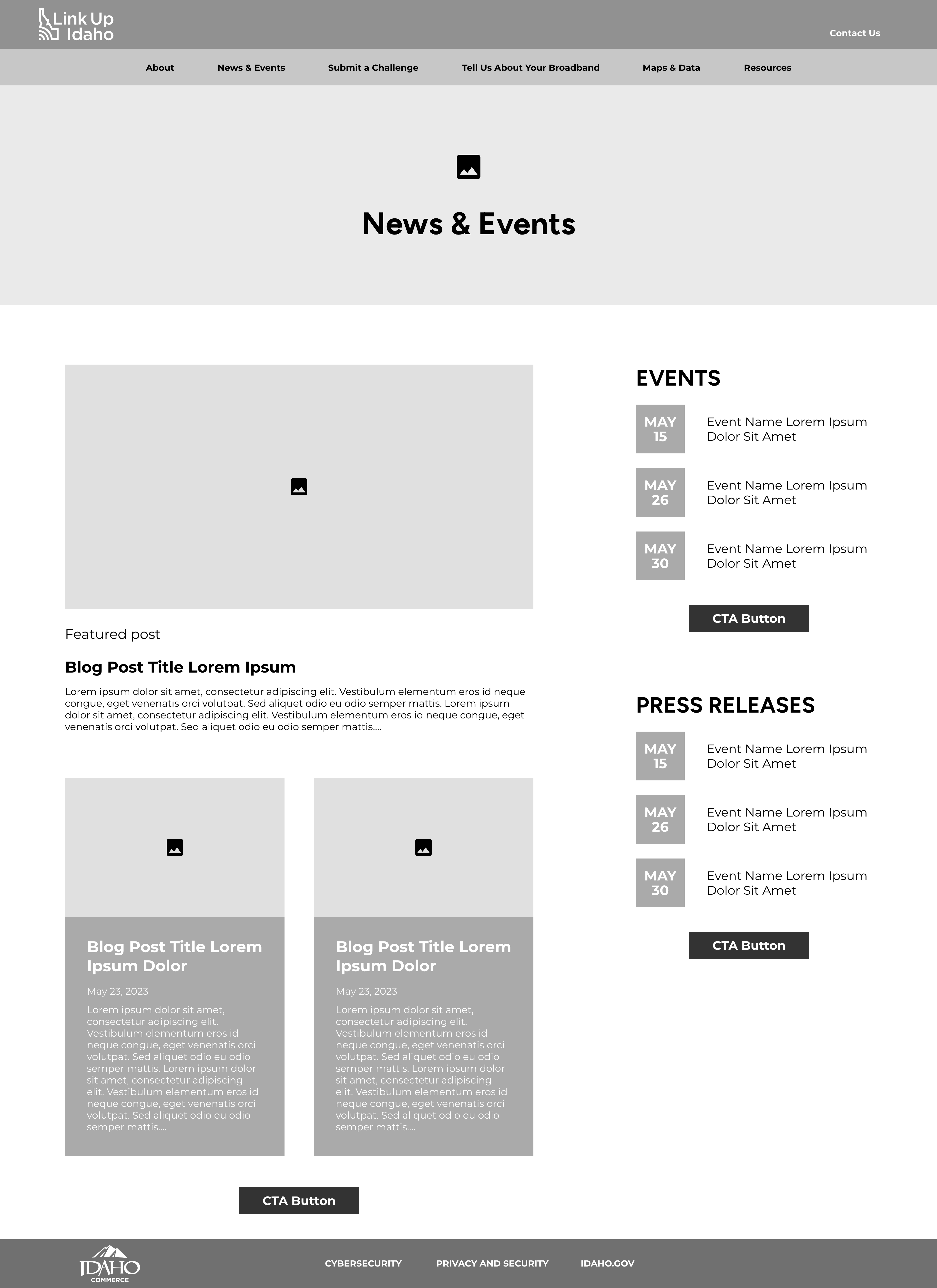
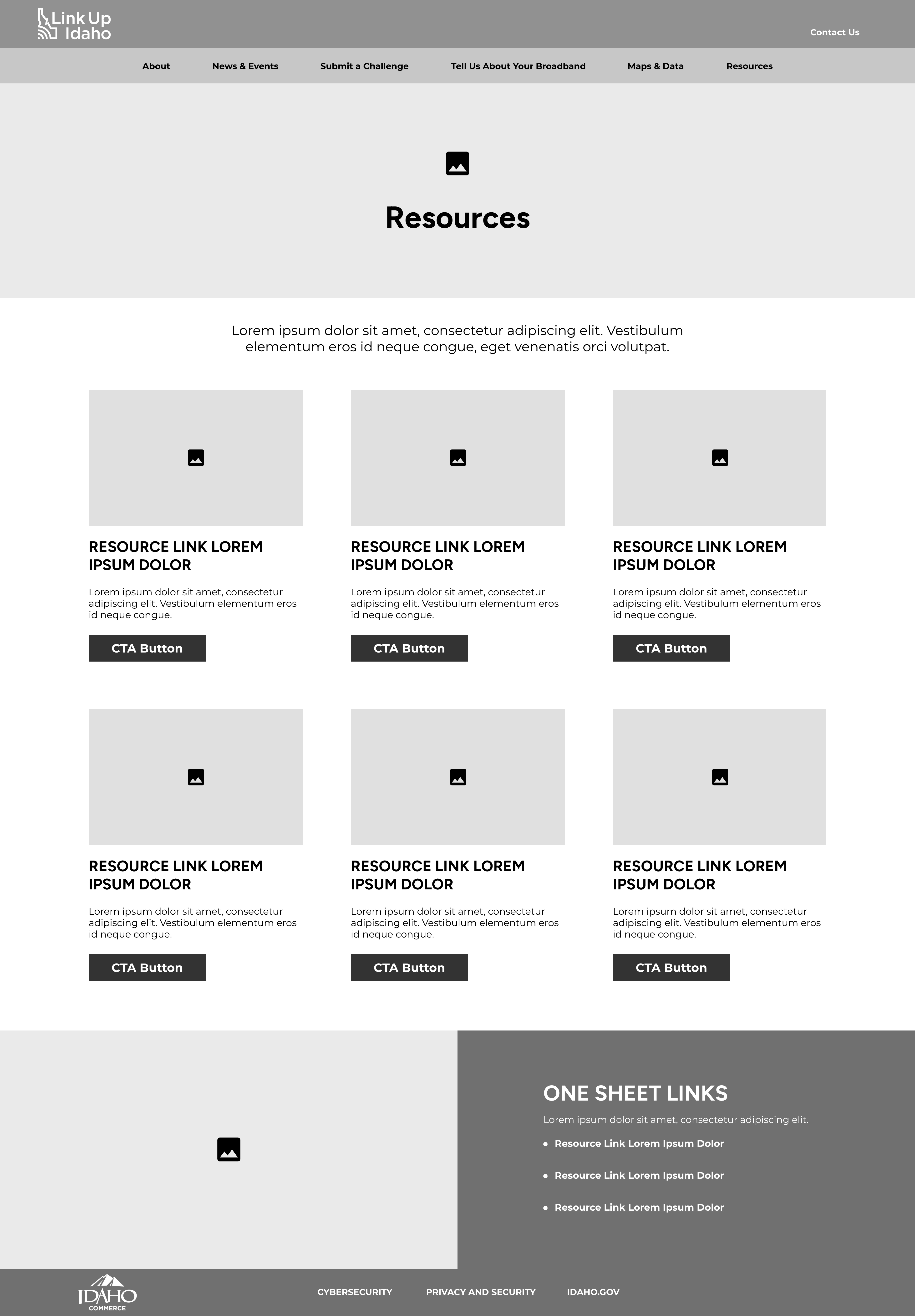
After presenting the user flow to the client, I developed low-fidelity wireframes for desktop and mobile interfaces.
One of the main issues I wanted to tackle was to create a website that was visually appealing and simple for users to navigate. I played around with the nav bar and experimented with a sidebar menu versus a traditional nav bar at the top of the page. I also thought about a block layout on the homepage to add visual movement throughout the page so the user isn't continuously scrolling to find the information they need.
User Testing
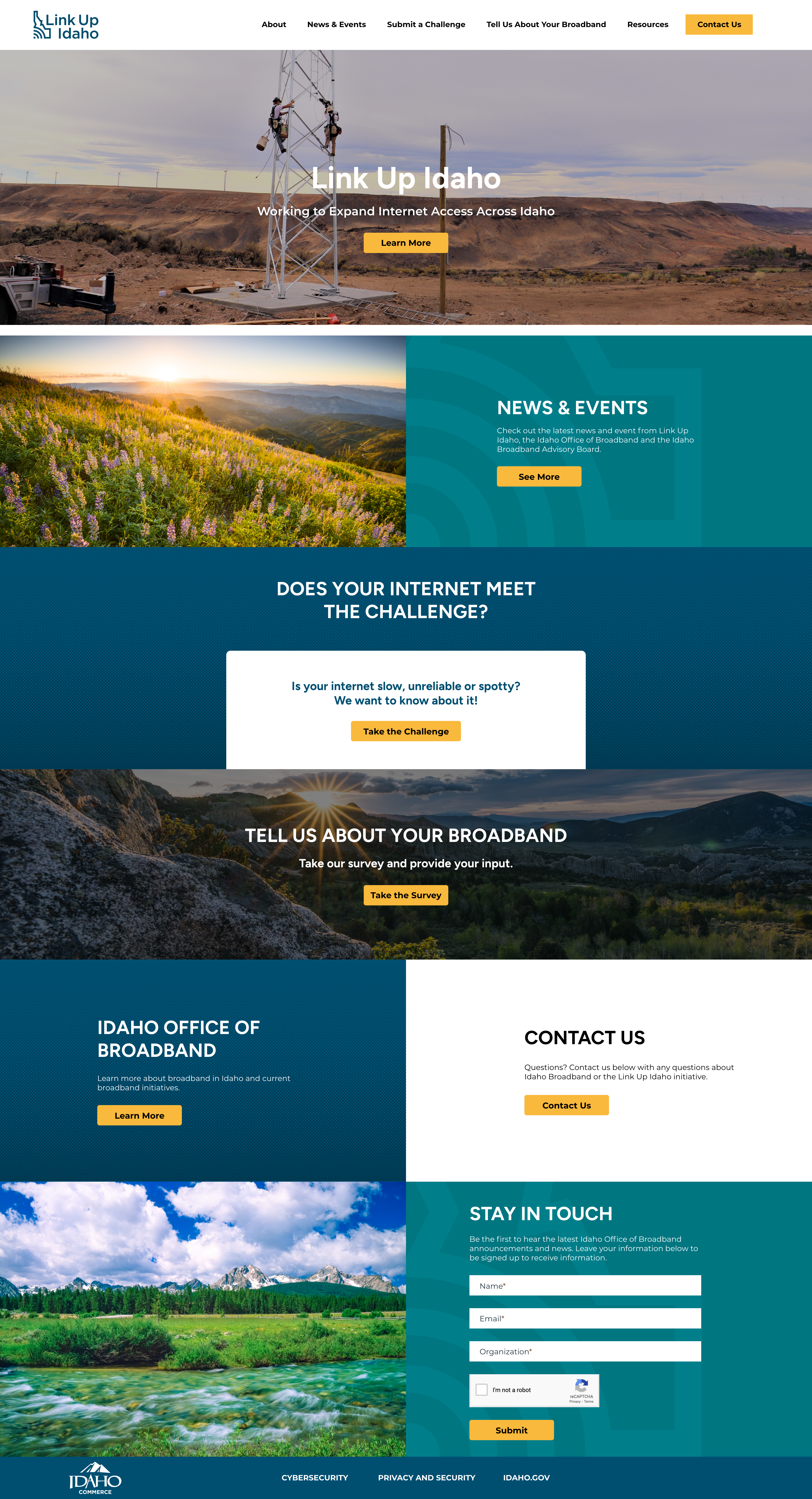
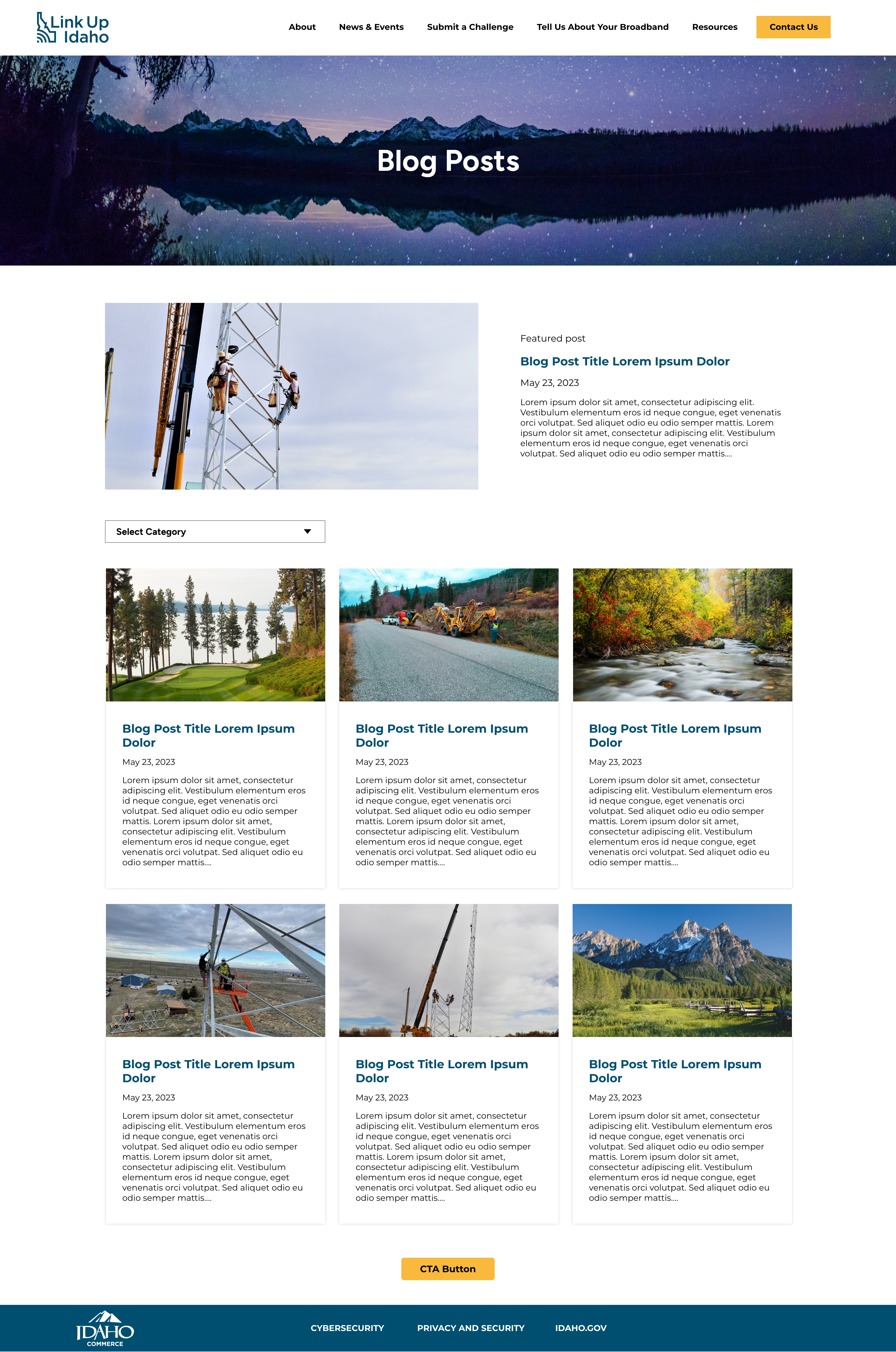
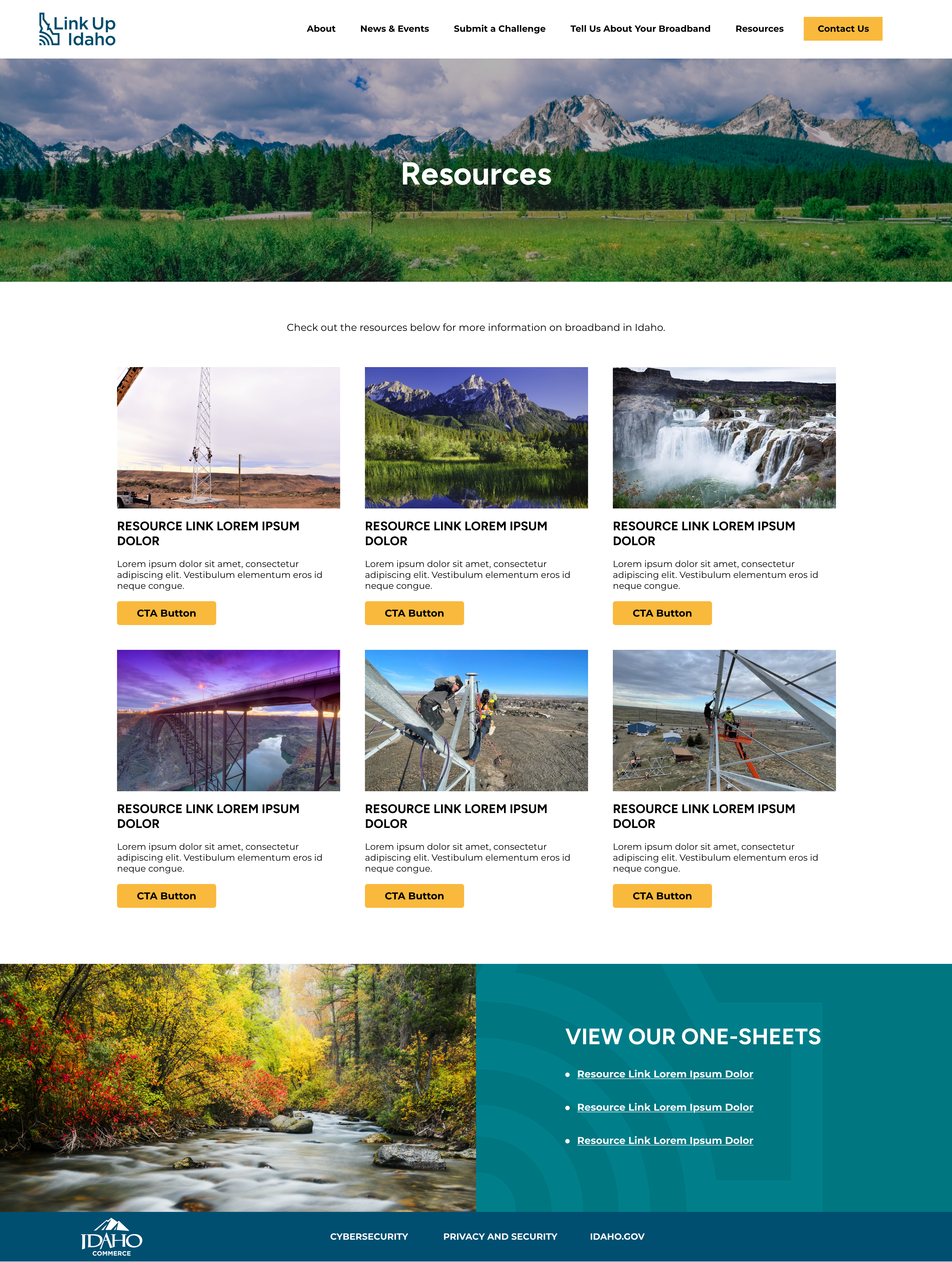
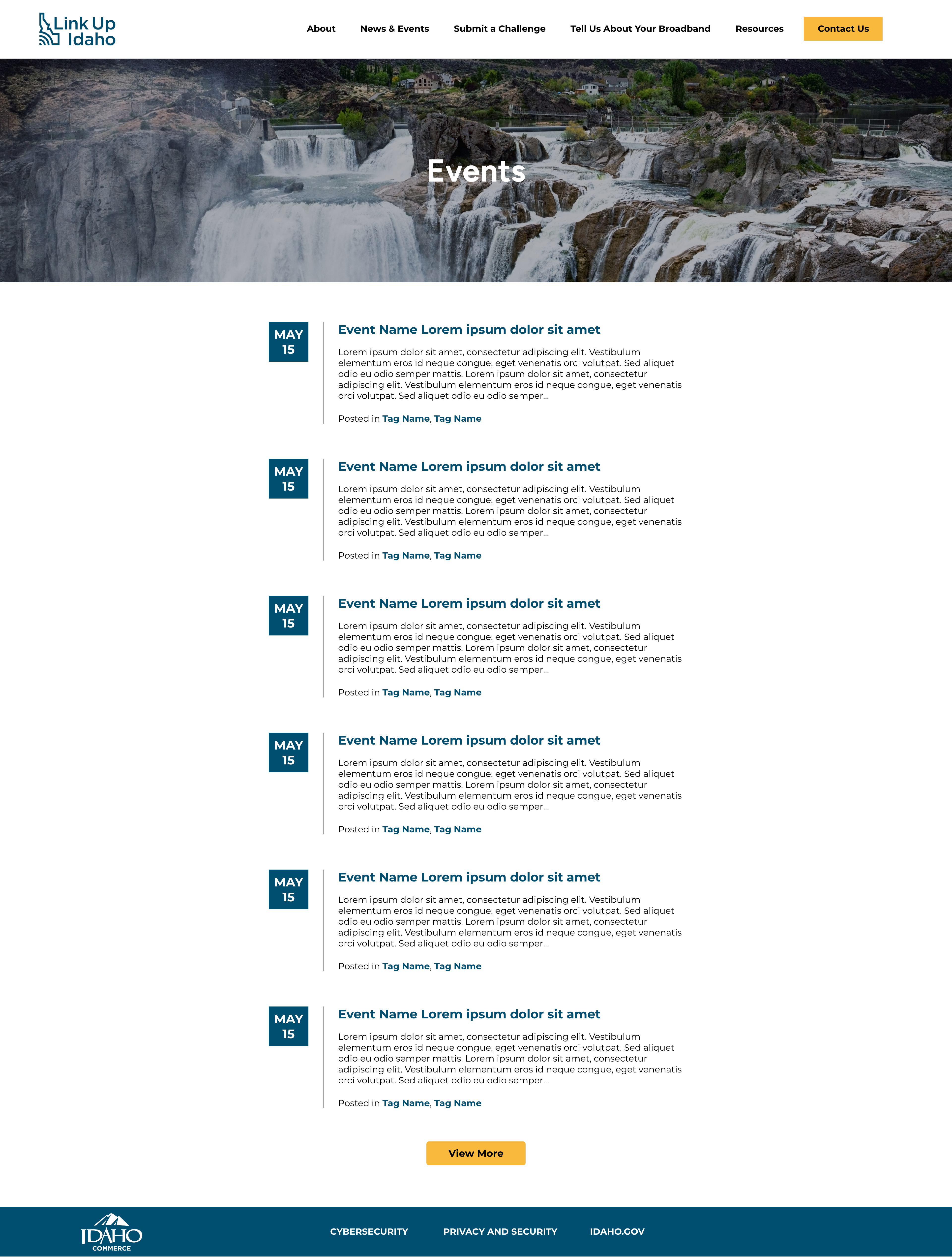
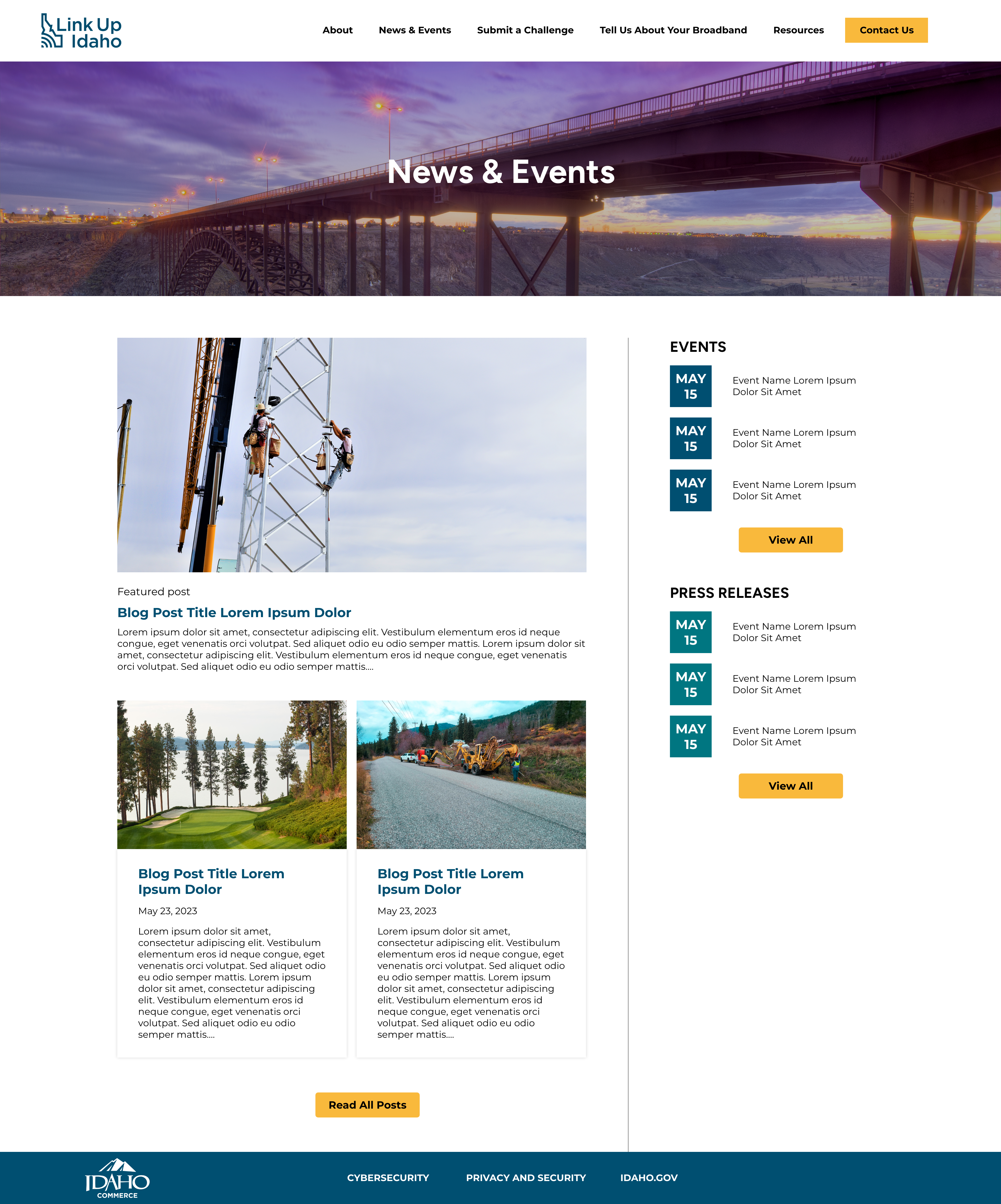
Once the wireframe was client-approved, I went into the website design phase and developed high-fidelity wireframes. I brainstormed which textures and colors I wanted to use.
Once the internal and client review was complete, I prepared the XD file for development. After the page was coded, the development team sent it to the project team for QA. I looked through the website and ensured that all functions in the high-fidelity design mock were on the coded site.
I mainly checked for website responsiveness in different browser sizes and mobile. The image placements and text styles were also important to check in this stage so they matched what the client had seen in the design mock.
High-Fidelity Desktop Wireframes
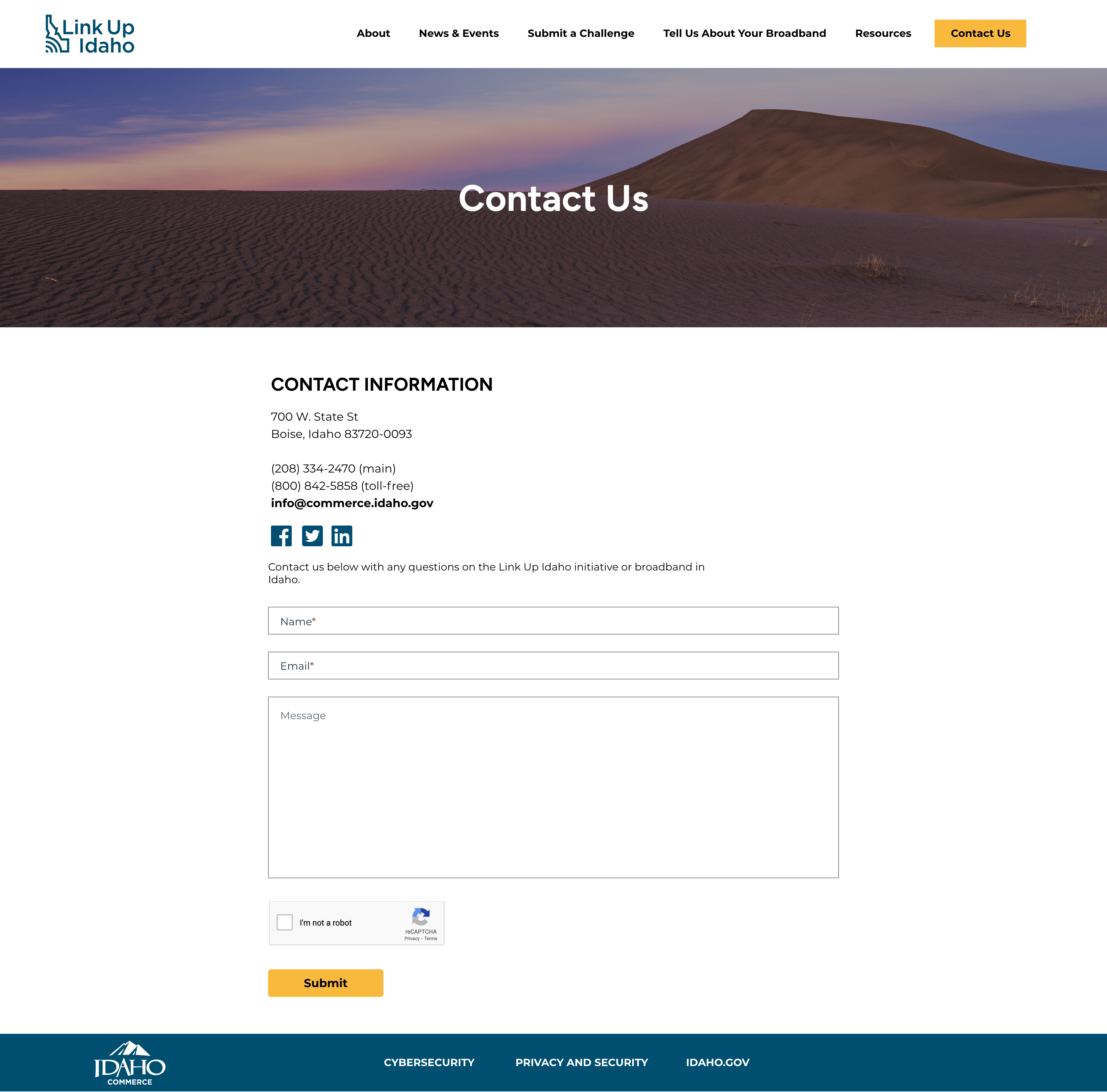
High-Fidelity Mobile Wireframes


Style Guide
Next Steps
Once development addresses the issues mentioned in the QA process, it is sent to the client for review. After the client approved the coded website, it was pushed live.
