Duration
1 year, May 2019 – August 2020
My Role
Graphic Designer
EnterpriseWorks
Through my internship at EnterpriseWorks, I gained familiarity with collaborating with start-up clients at the University of Illinois at Research Park and conceptualizing designs to promote the Research Park brand.

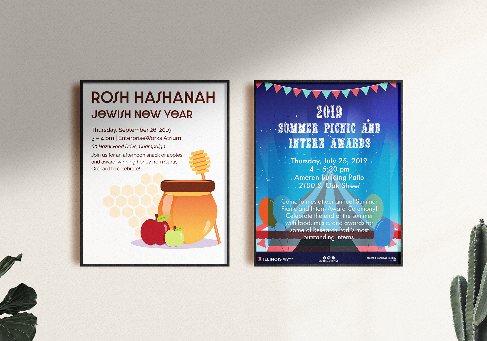
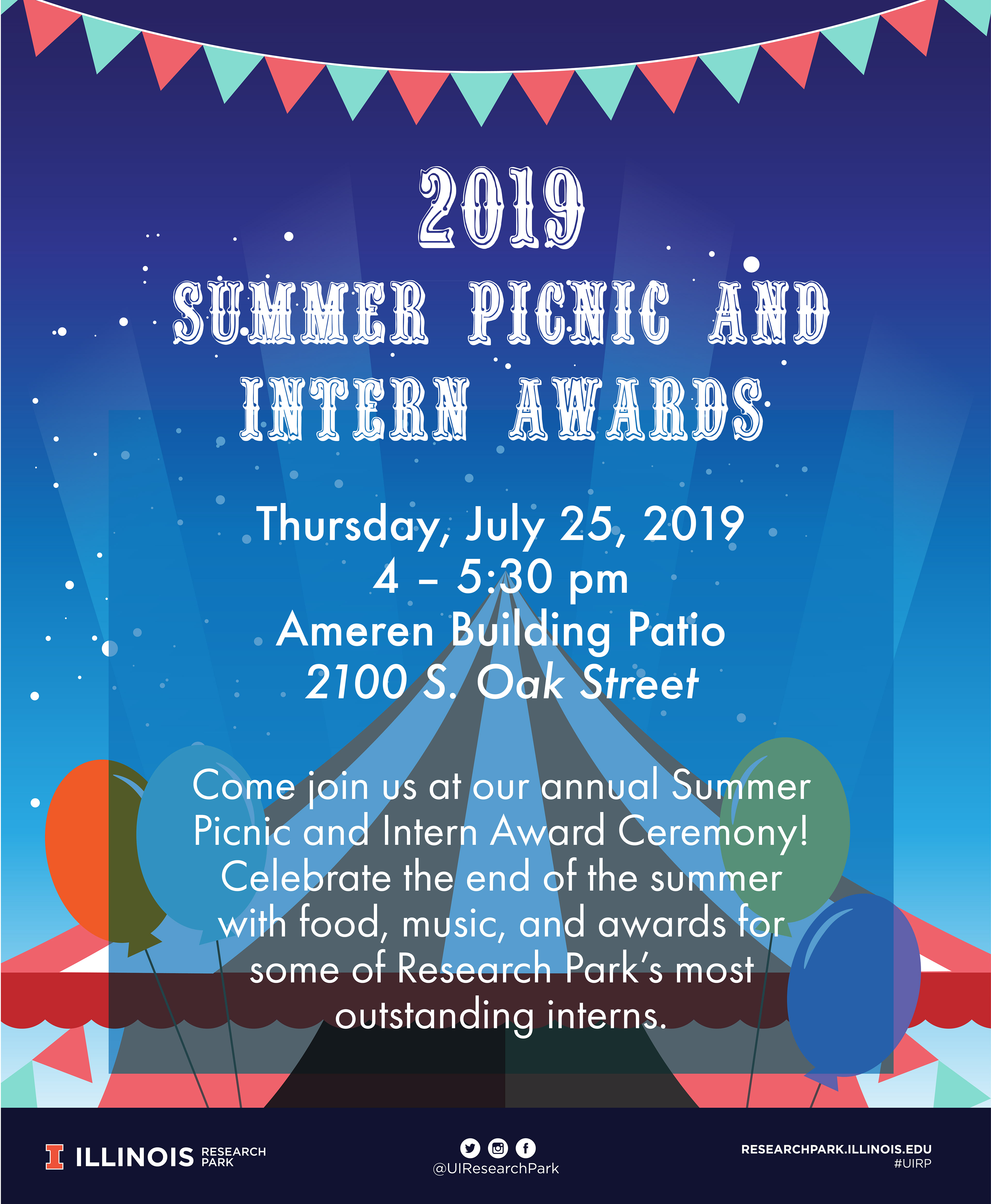
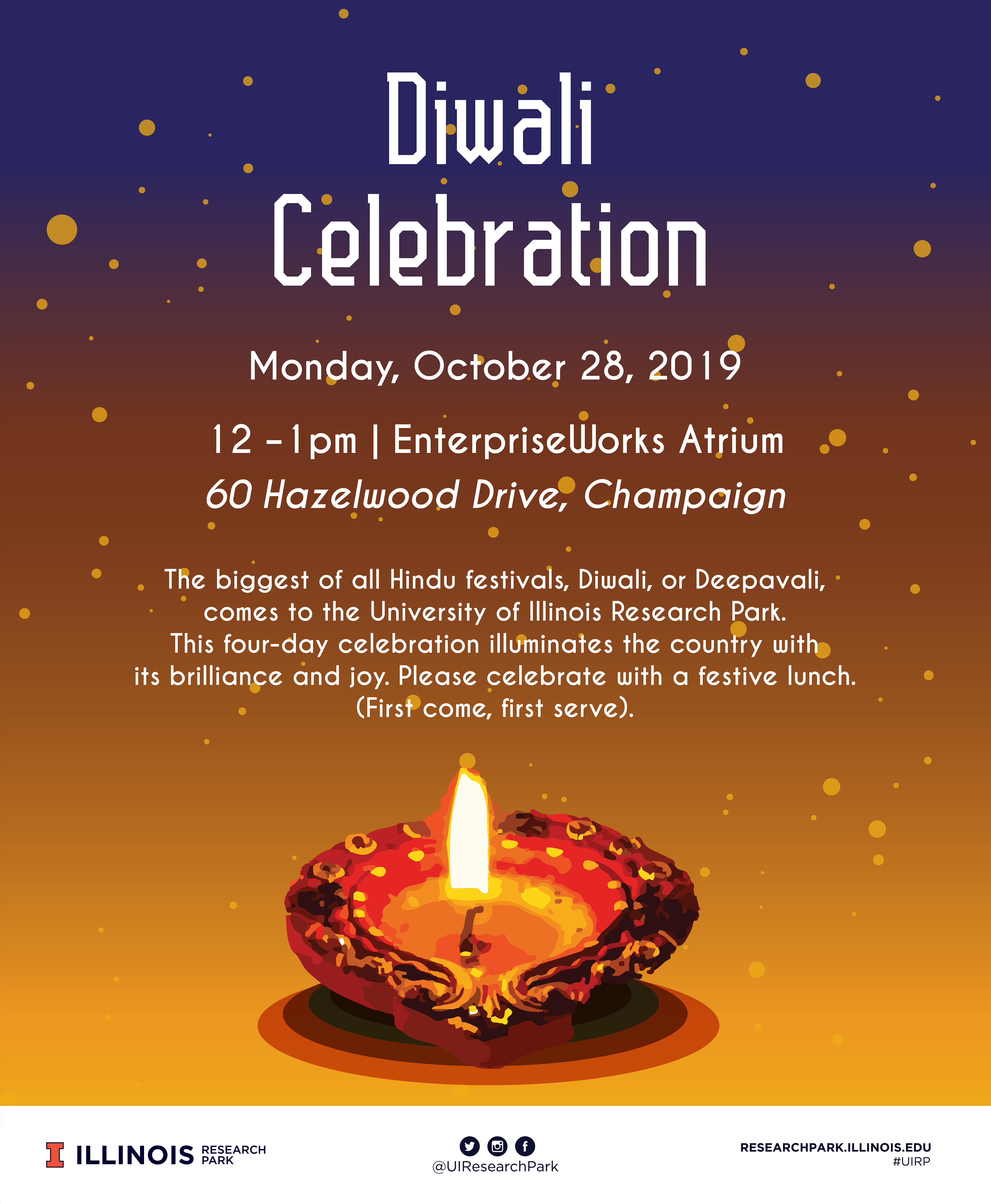
Atrium Posters
Using Adobe Illustrator, I designed these posters to promote upcoming events at Research Park. Printed posters were hung up in the EnterpriseWork building's atrium, and I created additional sizes to promote the event through digital signage and social media.

Cyber Secure Dashboard Logo
Cyber Secure Dashboard (CSD) is a nonprofit tech company under Heartland Science and Technology Group. The client came to us with the task of redesigning their logo to represent their brand better, which is targeted toward big contractors and corporations that understand cybersecurity.

Cyber Secure Dashboard wordmark logo, 2020
Process
During the intake meeting with the client and our EnterpriseWorks project manager, we discussed what colors and fonts the client would like to use for their brand. The client wanted a font that was more modern and not too conservative yet attractive to mid-sized businesses.
Based on that information, I chose strong, sans-serif fonts to give the logo a modern look the client envisioned while also giving the company name importance through its bold type. After deciding on a color palette and font, we moved into the next stage and created three different logo designs for the client to choose from and move forward with.
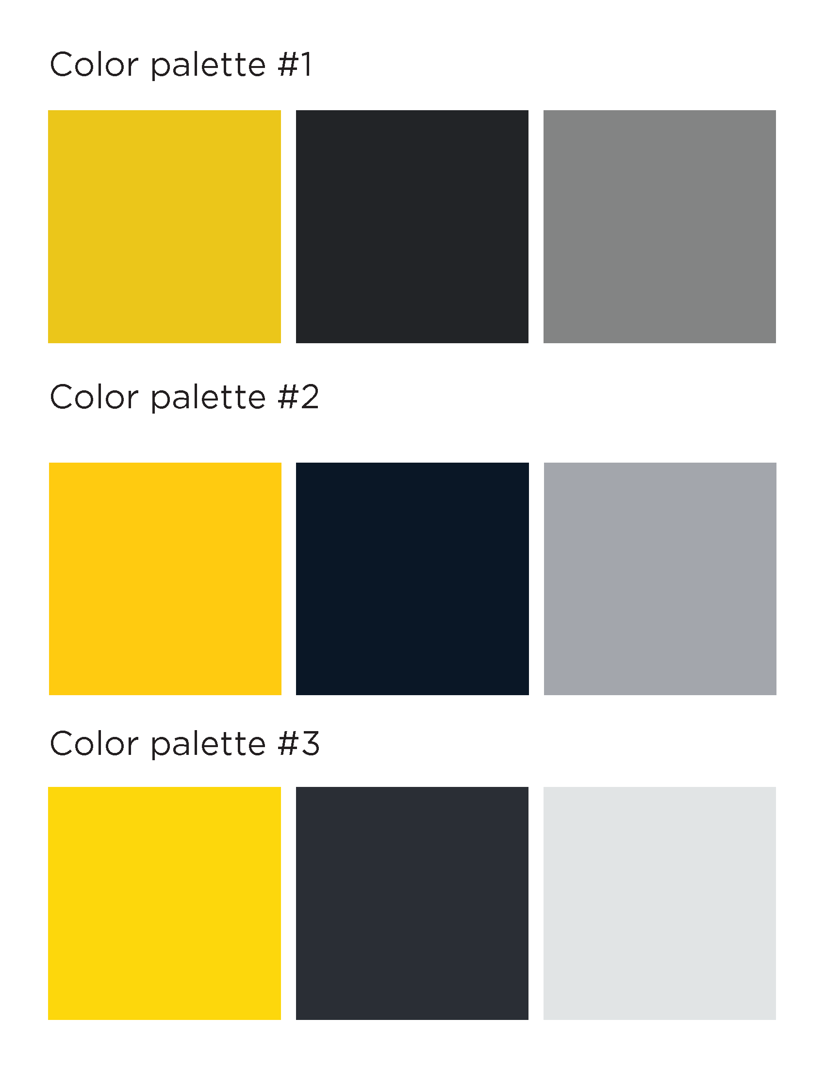
Color palette options
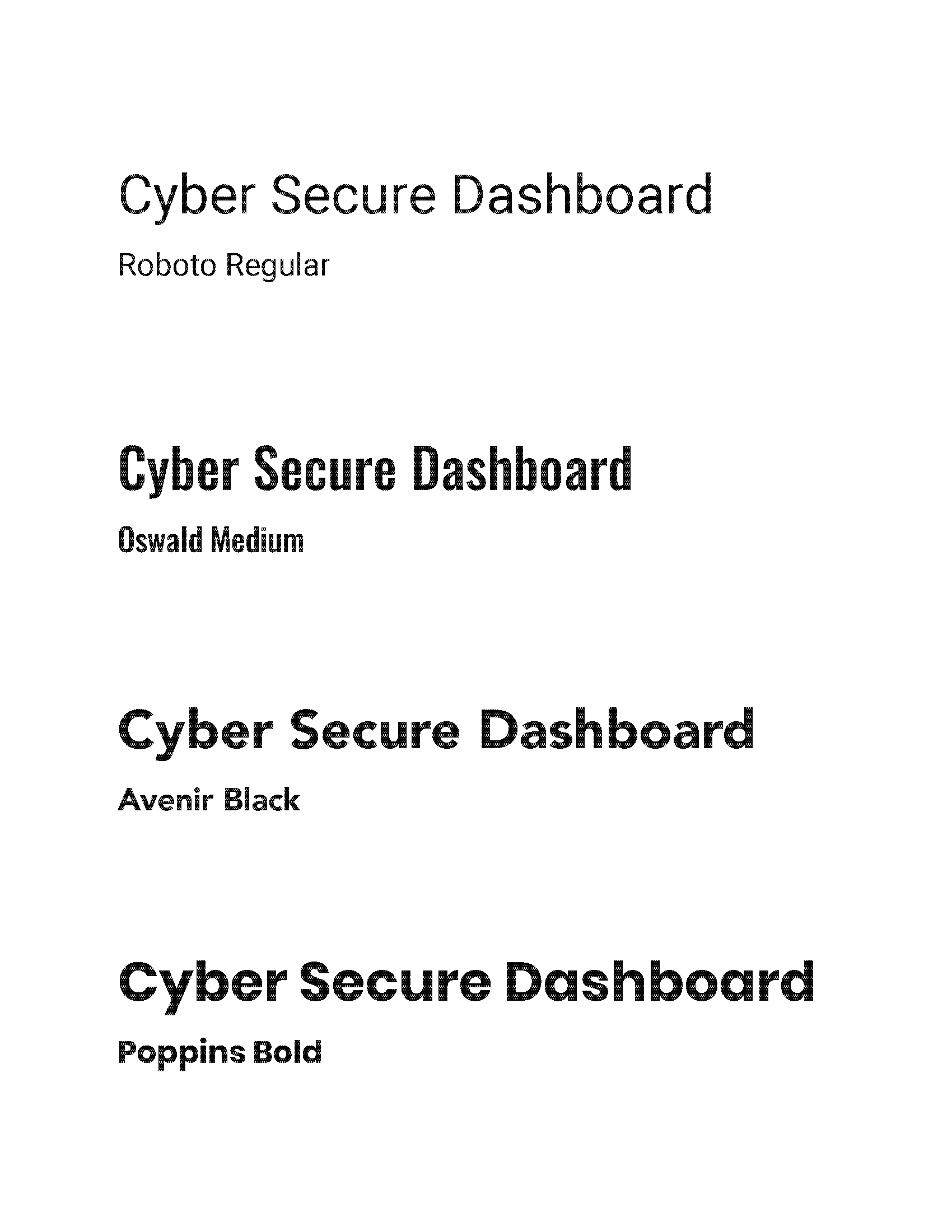
Font options
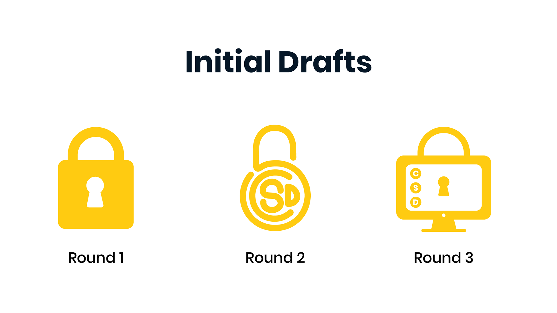
Initial Drafts
I created two initial drafts based on the client-provided imagery– A lock because it represented cybersecurity and tracking.
The client liked the second draft the best because the company initials, CSD, make up the shape of the lock and add to the personalization of the logo. However, they wanted to see imagery that was less whimsical/rounded and incorporated more of a padlock-style lock rather than a bike lock, so I referred to their feedback and further revised the logo.
Final Logo

Cyber Secure Dashboard final logo, 2020
Style Guide
Along with providing the client with a final logo, I also created a style guide for future reference so the client can update the website branding to follow their new logo design.
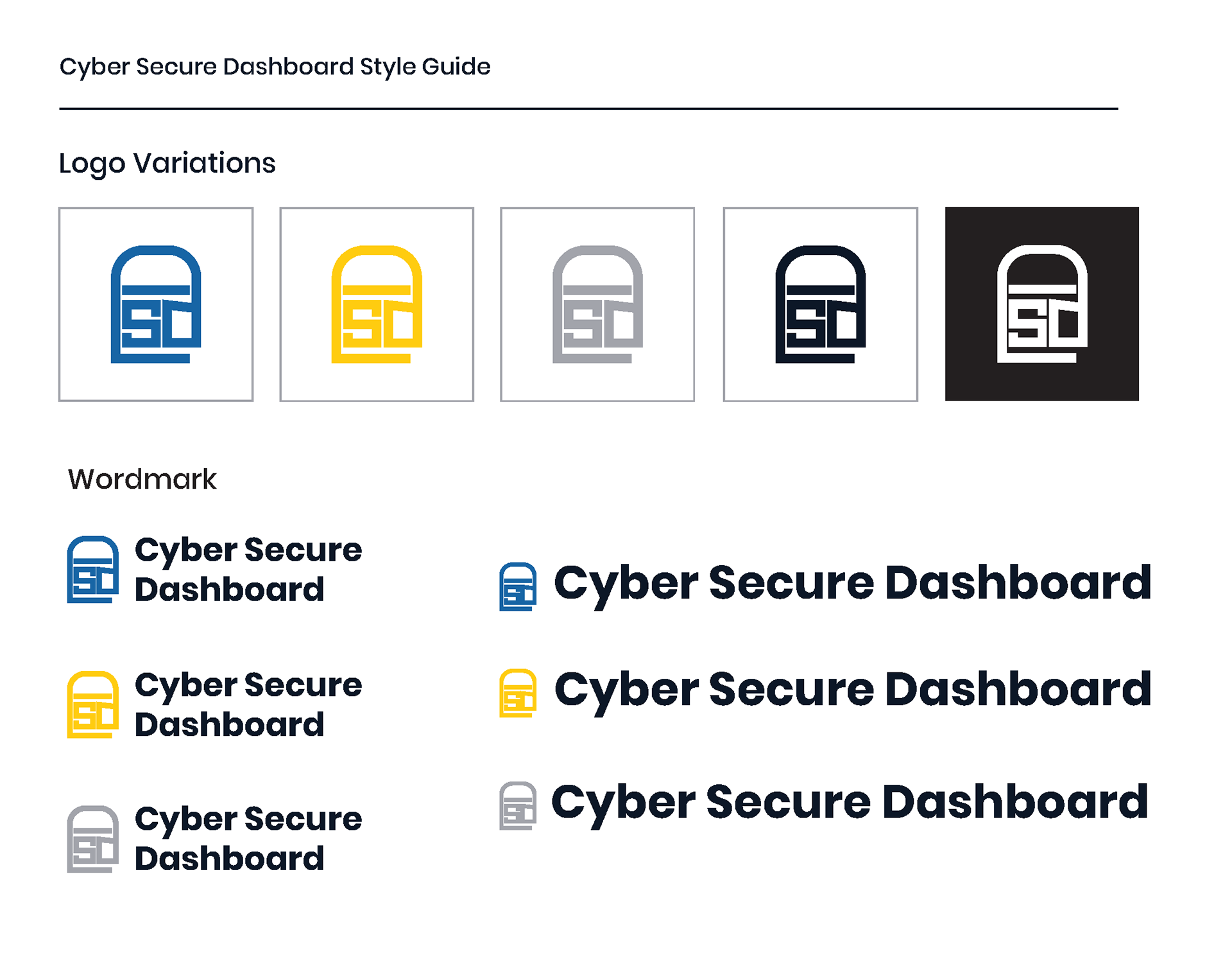
CSD Style Guide
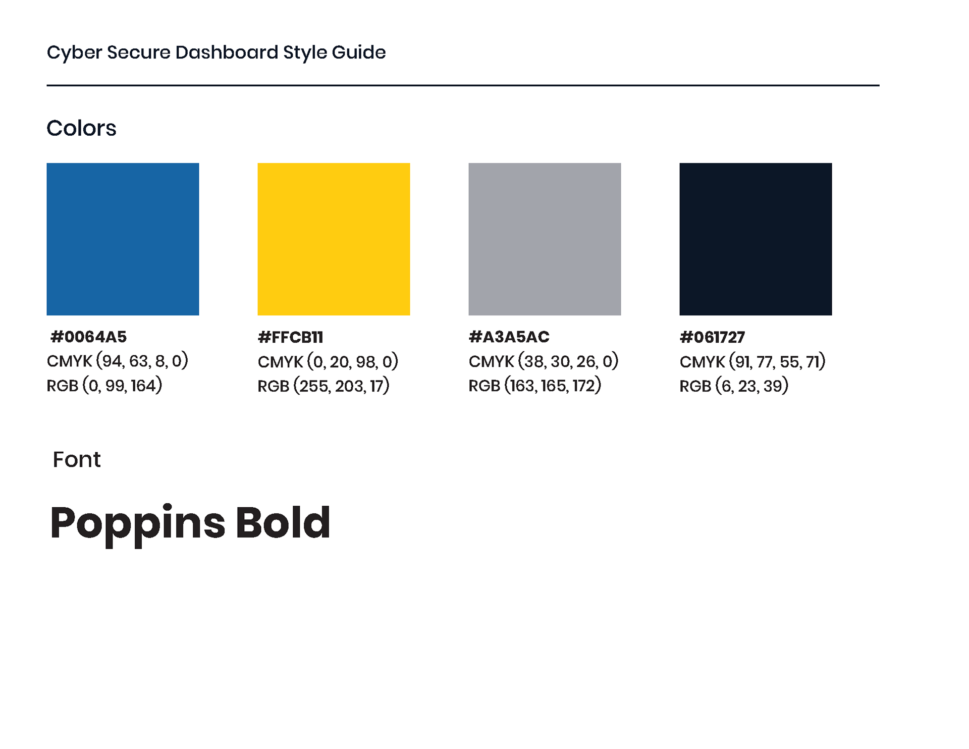
CSD Style Guide
Viewpoint Neurology
Viewpoint Neurology is an outpatient neurology care center that wanted to update its brand materials with a newly designed brochure, postcard, and pop-up banner.
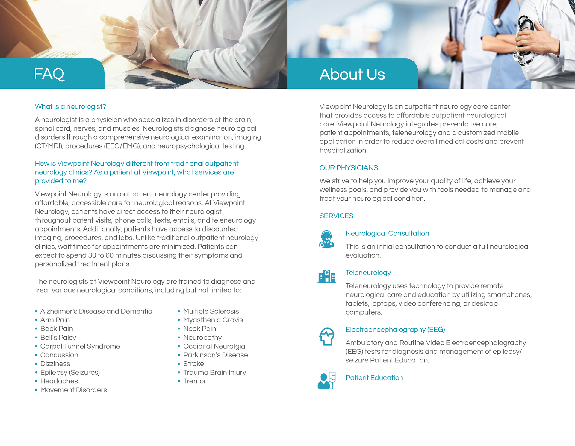
Viewpoint Brochure Draft 2
Draft 2 interior
Process
The team and I held a client intake meeting to discuss which colors and fonts the client would like for their brand. The client provided the content copy along with the logo.
For the brochure, the client wanted the design to be diverse and have a crisp, clean, fresh image because their medical office is not the typical one would go and wait in line for.
For the colors and typeface, they wanted to match what was already on their website, a muted blue and gray color palette. The logo they provided used a font called Questrial, which I included in the branding materials.
Old Brochure Design
The client provided their old brochure, shown below, and using that as a starting point, I reworked the existing draft to one that was more cohesive and visually appealing while also keeping the previous imagery.
Old Viewpoint Neurology brochure, 2019
Old Viewpoint Neurology brochure interior, 2019
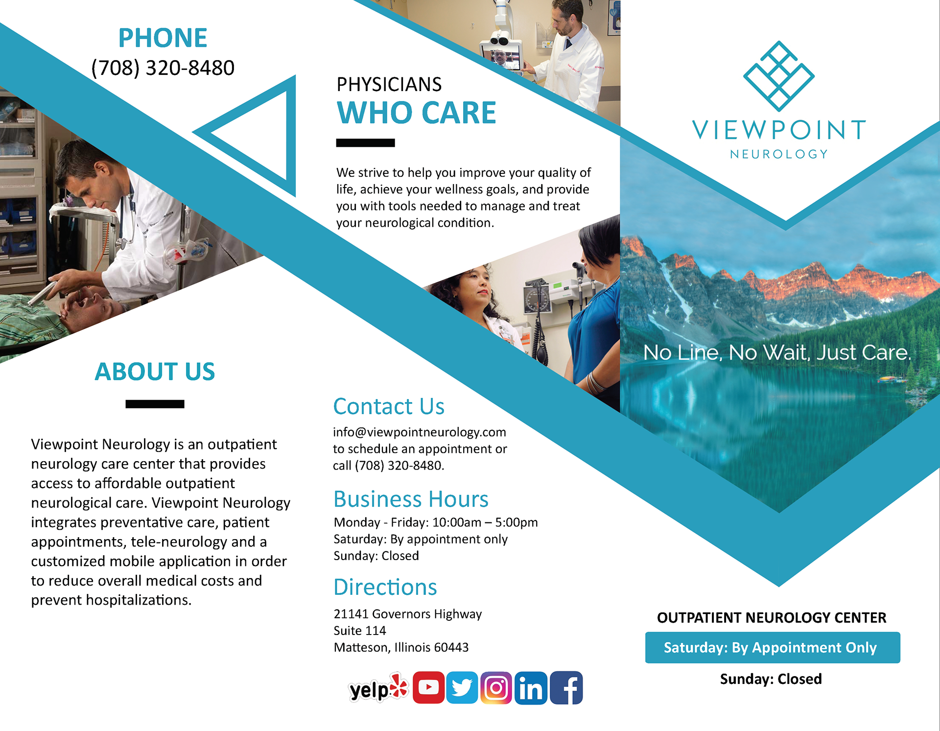
Initial Drafts
I thought an image of a mountain and lake was fitting because it evokes a sense of peacefulness, and since the tagline promoted a stress-free experience of "no line" and "no wait" at the care center.
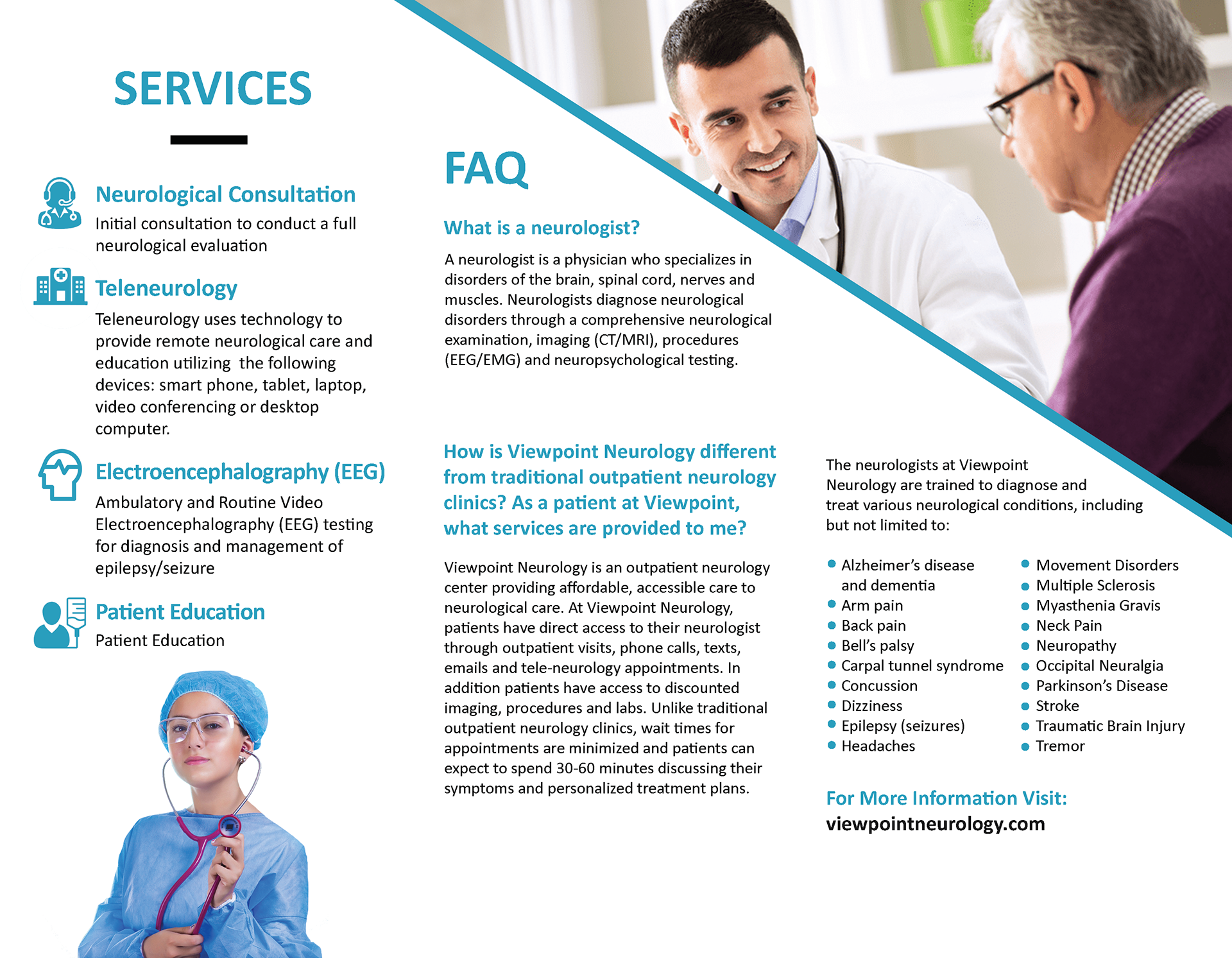
I laid out the text inside the brochure to be readable since the copy provides valuable information about the center. I kept the hierarchy in mind along with the original iconography so visitors can learn more about what types of care Viewpoint offers.
Viewpoint Brochure Draft 1
Draft 1 interior
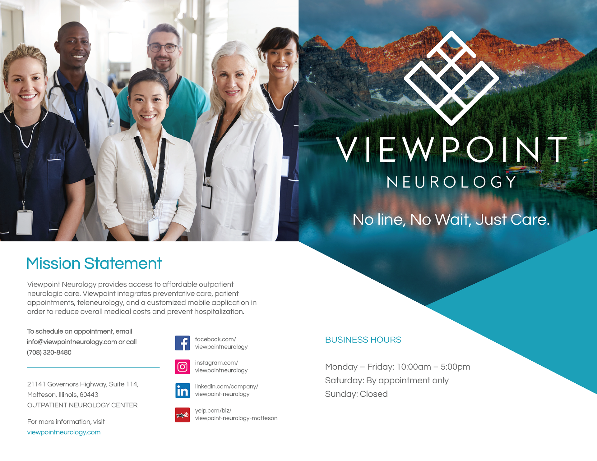
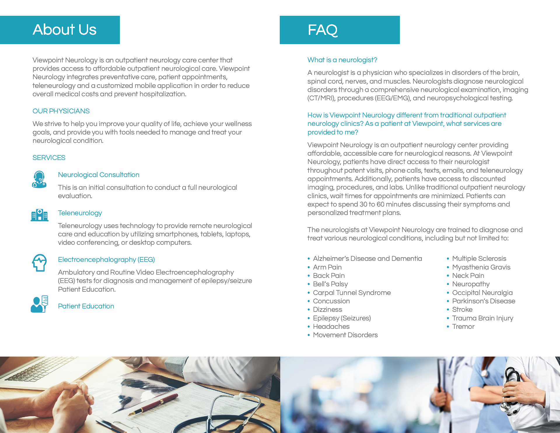
Final Designs
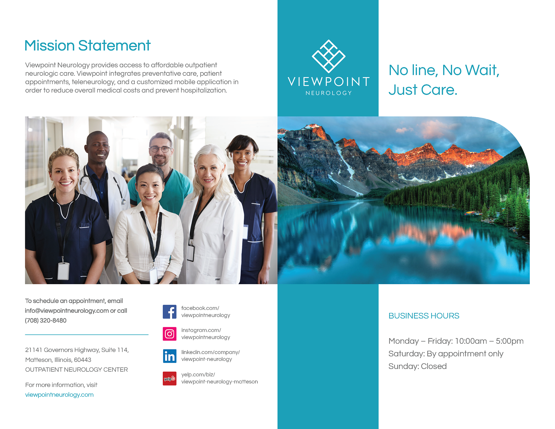
Using Adobe InDesign and Illustrator, I redesigned the brochure that would be given at the center, the postcard, and the pop-up banner.
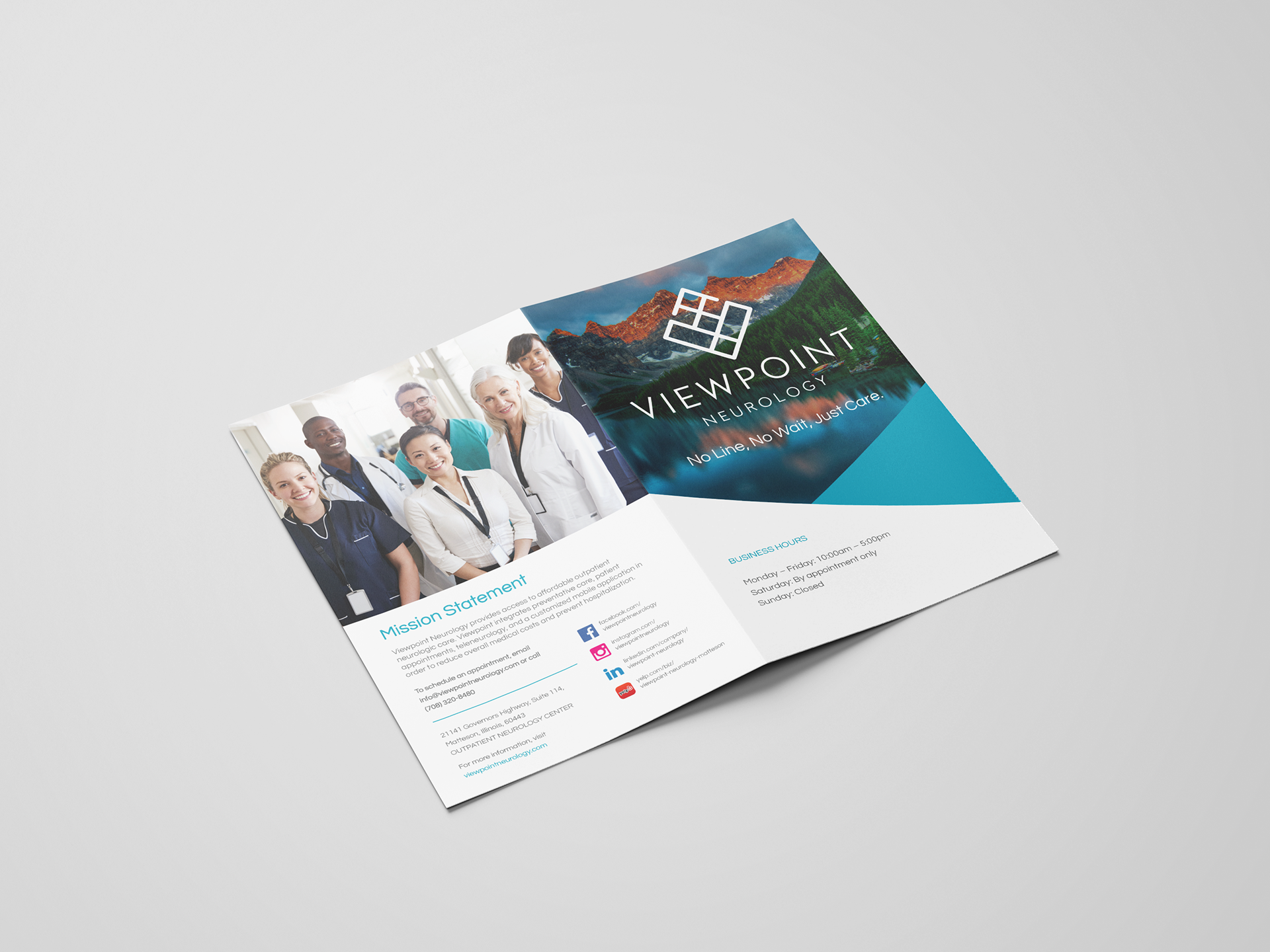
Viewpoint Neurology Brochure, 2019
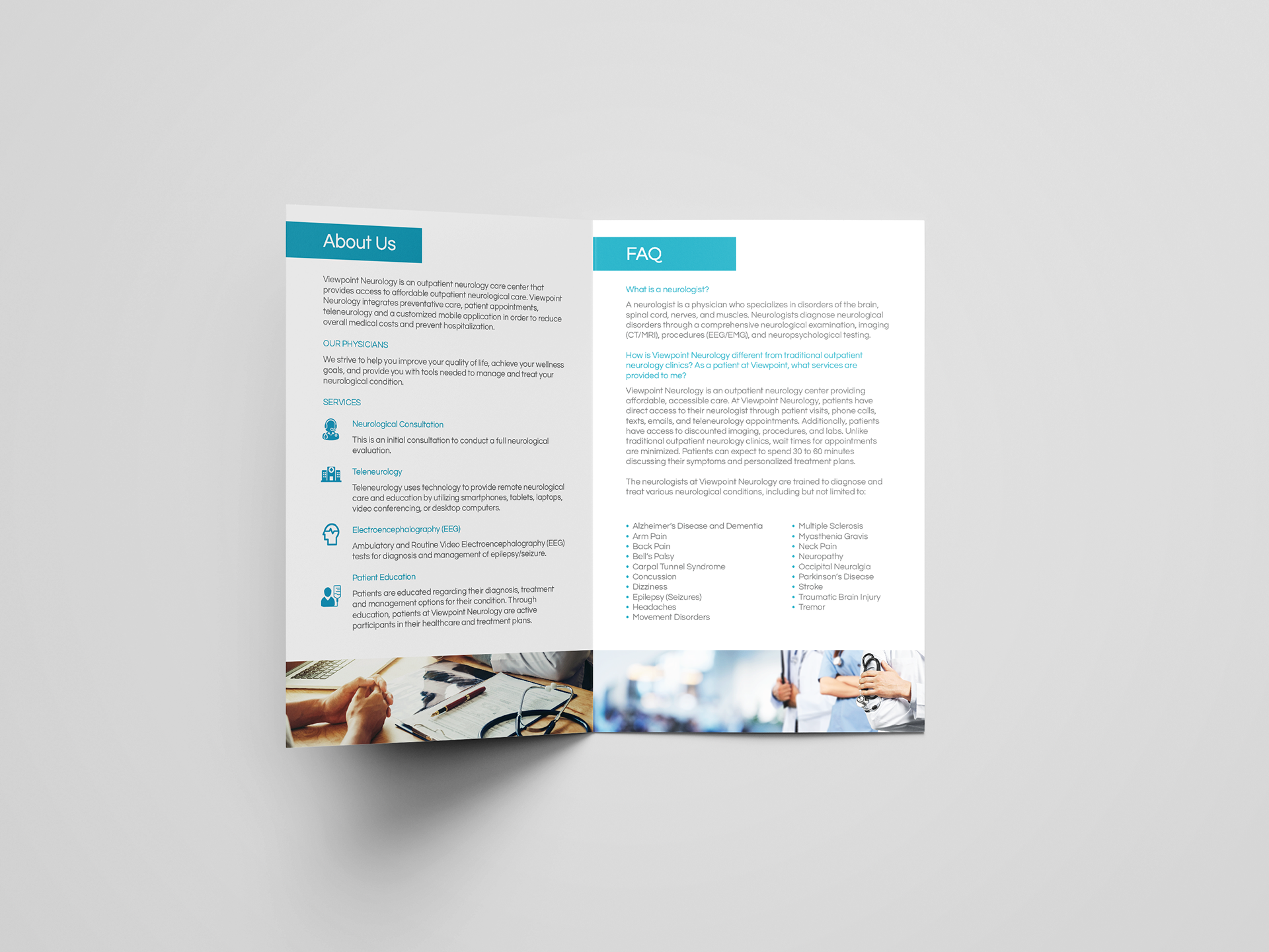
Viewpoint Neurology Brochure interior, 2019
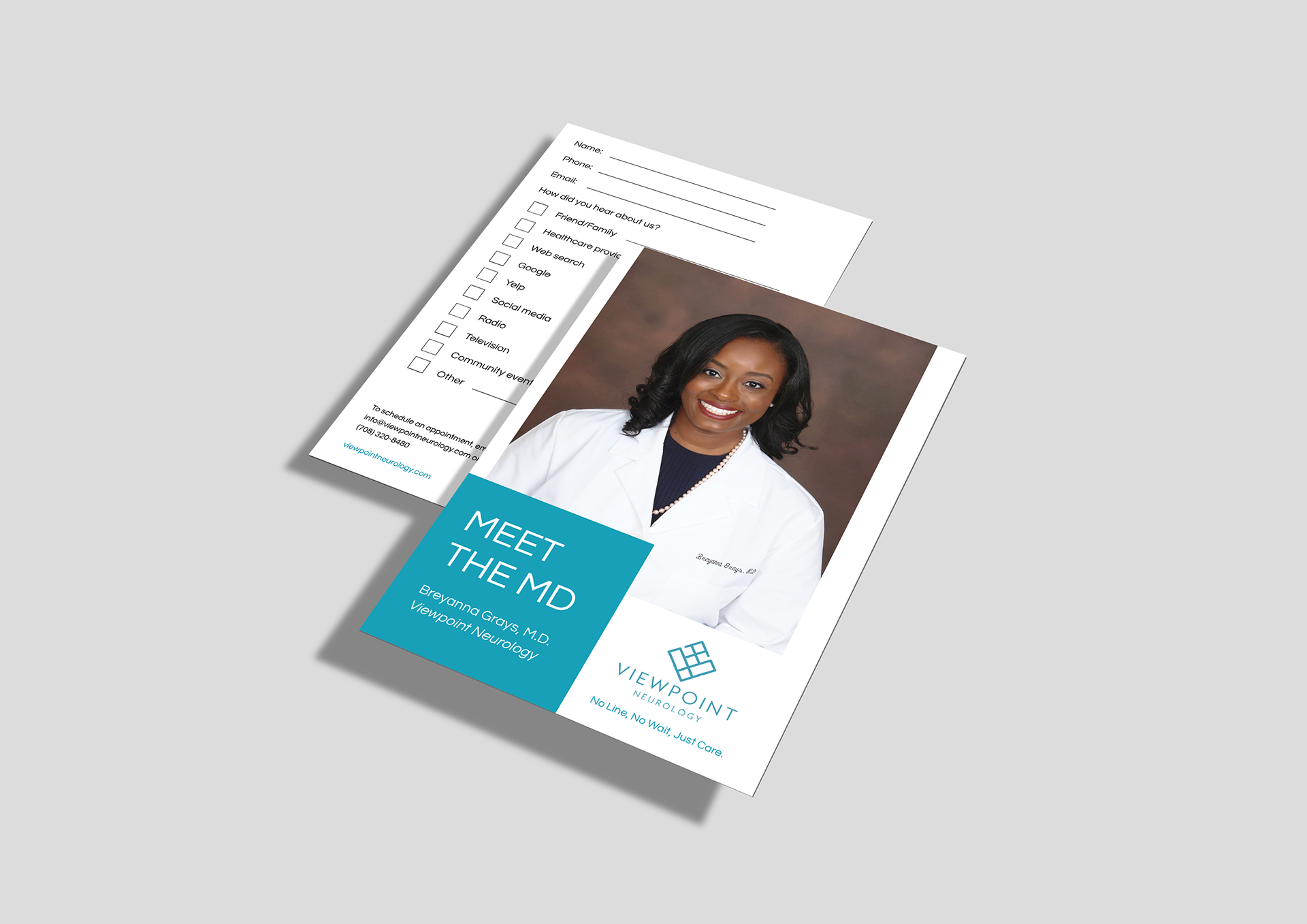
Viewpoint Neurology Postcard, 2019
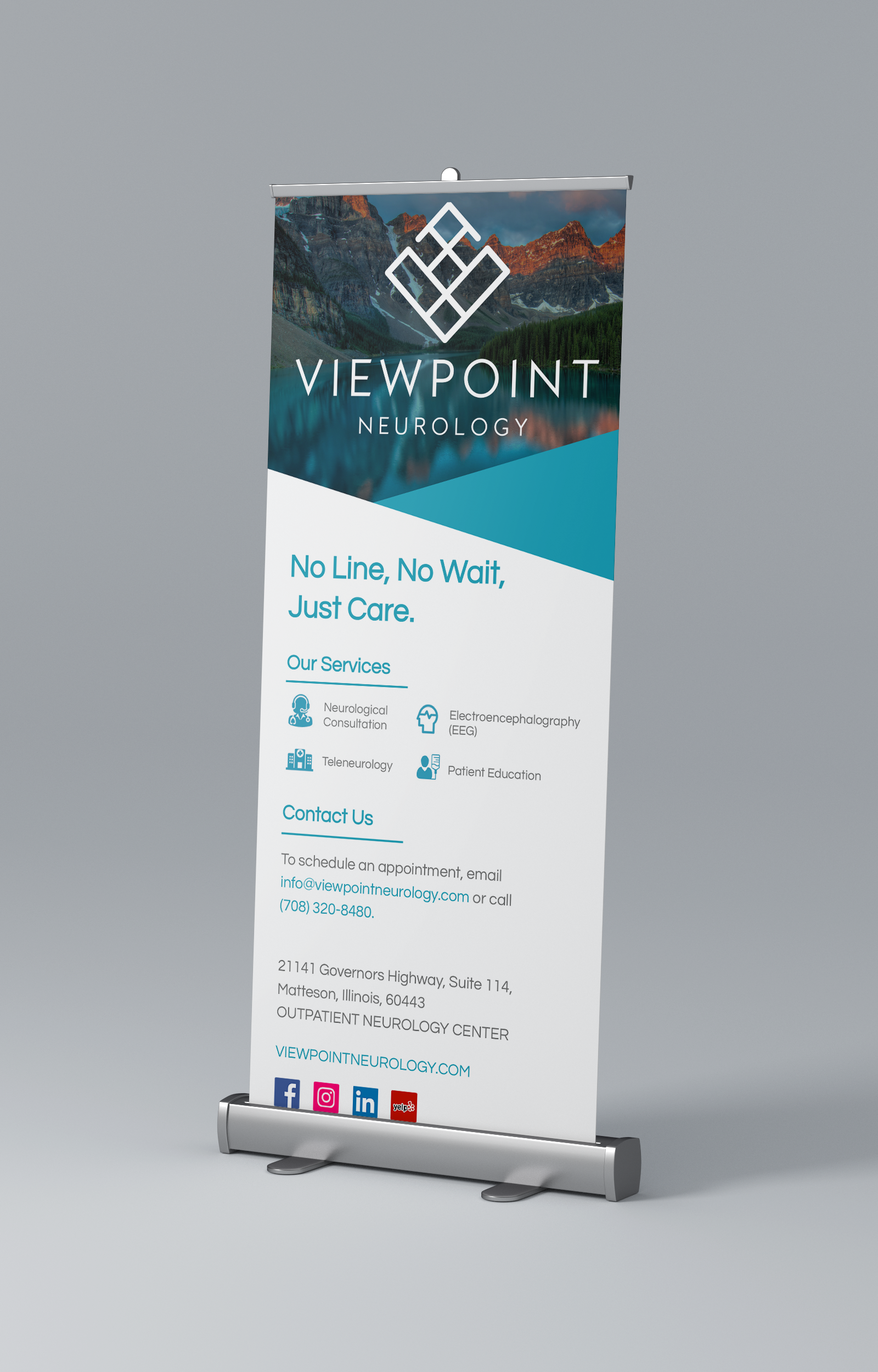
Viewpoint Neurology Pop-up banner, 2019
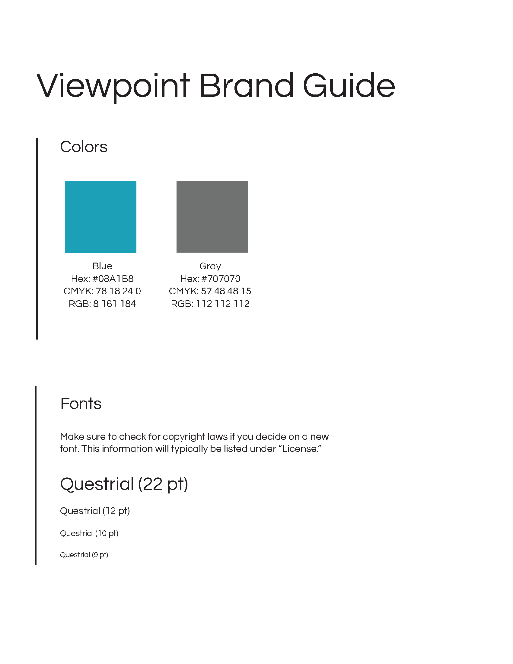
Viewpoint Neurology brand guide, 2019